When you’re working in the design industry, it’s your job to be on the forefront of the latest trends. Not only so you can make cool designs, but also so you can create lasting products for your customer. So here’s our look at what the top ten design trends for 2016 will look like:
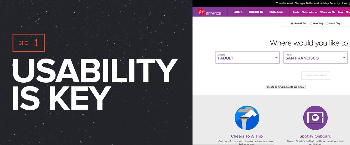
Engaging your users in a meaningful way is the future of all web interactions. It doesn’t matter how beautiful your design might be. If the visitor can’t quickly access the information they want, you’ll lose them.
Usability goes beyond just button interactions or website content flow. One second of bloat o your mobile site means a drop in sales by 27%. Creating the fastest, smoothest site with your user in mind should always be your main goal.
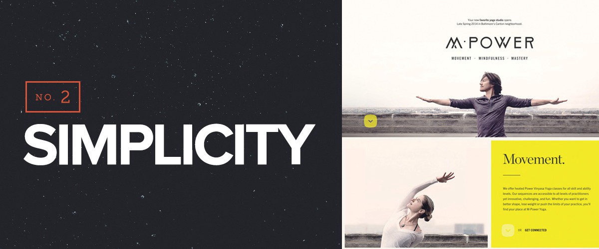
Much like usability, keeping your site simple improves the experience as well. Remove any unessential information. Allow your user to find and interact with the content they need, quickly. Good app design is a great example of keeping content as simple as possible. Use your favorite app and notice how easy the options are. You can do what you want within seconds, without (hopefully), digging to complete basic tasks.
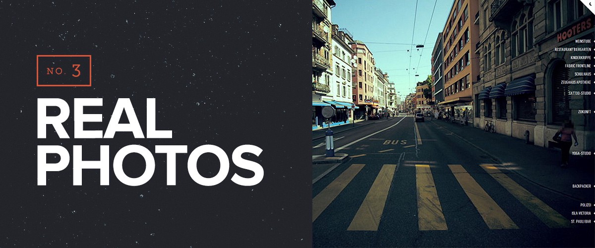
We can’t help but gag when we see bad stock photography. You can always tell the difference between a genuine photo vs. a stock photo, especially when you see the same photo everywhere. Take the time and find visuals that fit the design. Take the photos yourself, hire a professional, or create a custom graphic instead.
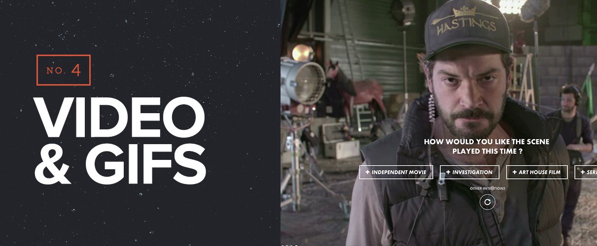
It’s proven that people love video. From ads on Facebook to video backgrounds, the moving image can help bring a site to life. And unfortunately for those who prefer text over video, video marketing works better. Visitors are 64% more likely to make a purchase after watching a video. 80% of those recall watching a video ad up to 30 days after seeing it.
(Also, here are some tips on improving your video backgrounds!)
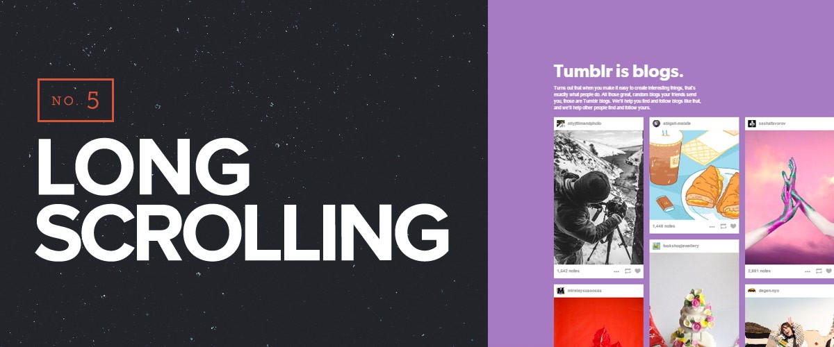
Placing all the important elements above the fold is now a proven myth — but not all clients know this. Thanks to sites like Pinterest and usability patterns on mobile devices, it’s proven that people like to scroll. Long-form scrolling is especially useful for storytelling which draws the user to progress towards a specific call-to-action.
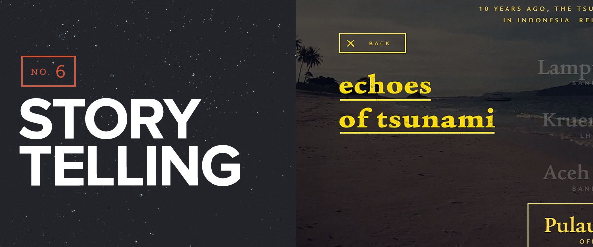
Many say this is the “next big thing” in web design. Unlike the “above the fold myth,” good web design is now used as progressive storytelling. Most start their users at the problem then work through to the solution and call-to-action. Using visuals like long infographics can help tell the story in bite-sized pieces. Users are seeking an experience and storytelling is one way to accomplish that.
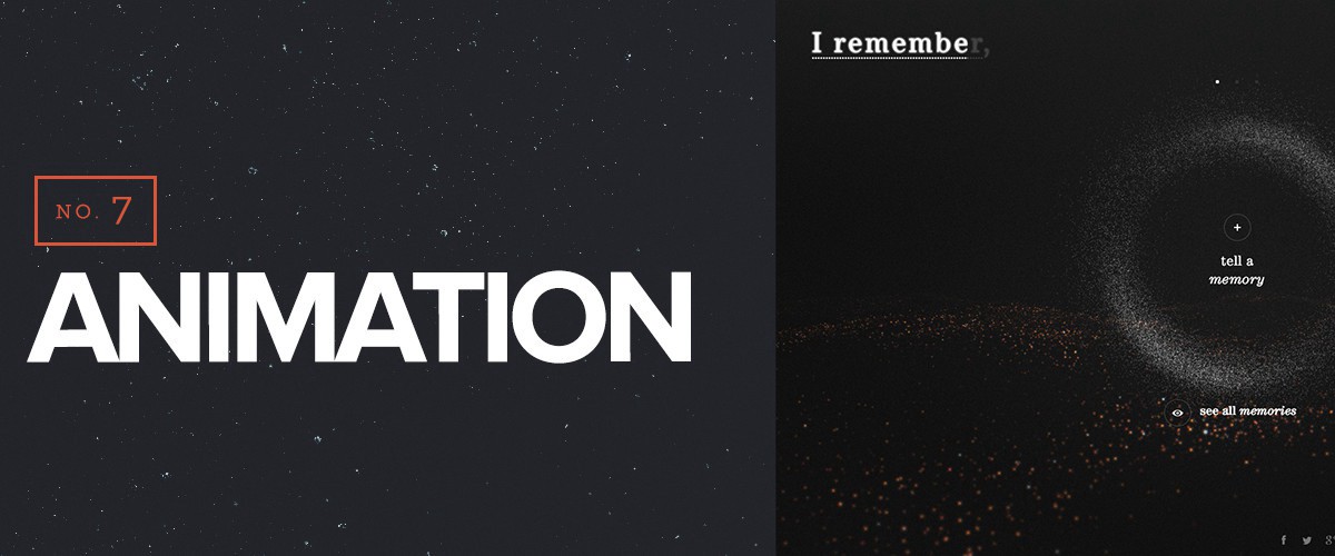
My stint in video game design taught me one thing: people love feedback. Play any video game and take note of what happens when you interact with the UI. You will notice audio, visual, and even tactical haptic cues as you interact with it.
Although web design is not the same as video game design, there something to be said about the satisfaction of visual interactions. Loading bars, navigation animations, scrolling transitions and hoverable states are all means to communicate to your user. I’ve been seeing more and more animations on websites, both subtle and major as web design continues to evolve. All the same, animations play a huge role in our next point: material design.
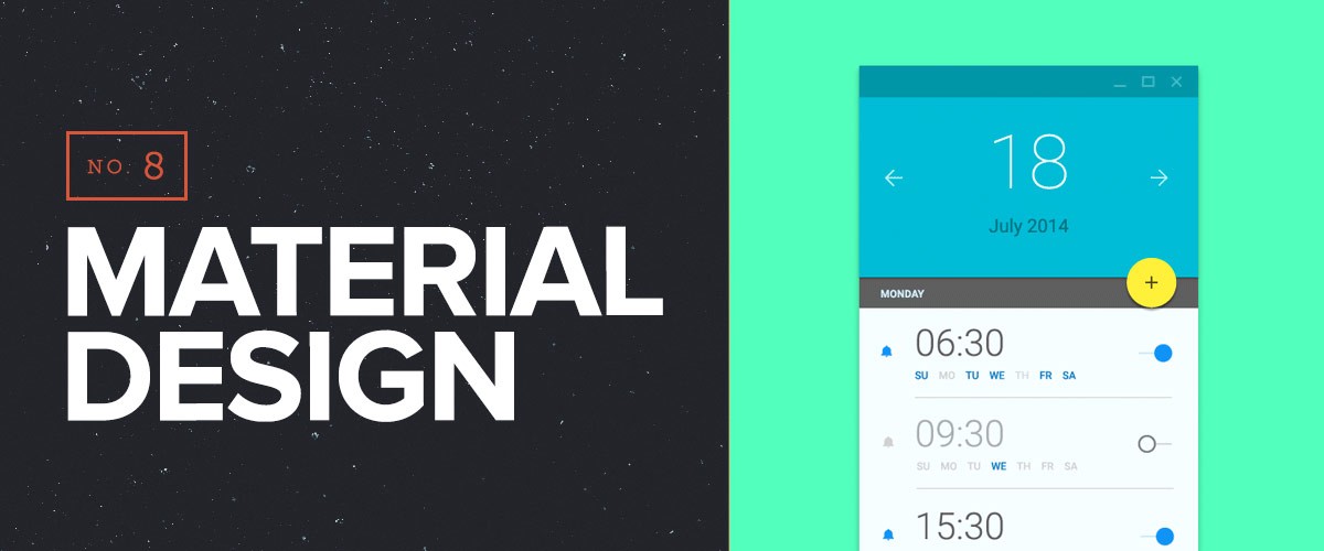
Last year, Google launched a new style language called “Material Design.” Material design builds from flat design, giving simple, optimized designs depth. It’s bold, graphic, and intentional. Material design uses motion to give feedback and draw attention to certain elements. It also uses concepts of 3d space (like shadows and depth) in a 2d world to give the illusion of realistic objects.
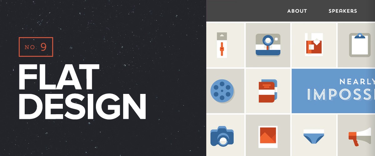
Just because material design is around does not mean flat design is dead. Long ago, it was argued to treat digital design like it’s own medium. It’s not print design. It’s not fine art. It’s pixels, rendered in real-time across many different screen sizes. I’m sure you don’t have to be told that making a div a solid color loads significantly faster than an image background. Creating flat designs also helps you focus on keeping the site minimalistic and focused.
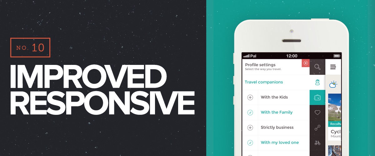
Your user is now everywhere. Mobile web usage has surpassed desktops, and people can be anywhere, at anytime, checking out your site. Half of the average B2B website audience is on mobile, so if you’re not optimizing for responsiveness, you’re disengaging from half your customer base. Responsive design should be standard; there is no doubt about that. But improved, optimized sites are the future of responsive design. Your site has to be flexible, and it has to be fast. Improving your frameworks, compressing your assets, and creating simple user experiences will only help improve your site overall.
Best of luck with your future creations!
