Websites create a person’s first impression of a nonprofit. And rightly so. According to SWEOR, “It takes about 50 milliseconds for the users to form an opinion about your website that determines whether they like your site or not, whether they’ll stay or leave”. This is why it’s important to make a good first impression with your potential donor.
We’ve put together 10 of the best website designs for foster youth and foster care organizations we’ve seen. We compare each websites’ navigation structure, design, tone, feeling, use of photos, and storytelling to help inspire your own website.
So get your inspiration foster youth nonprofit website design board ready and start pinning away:
1. National Foster Youth Institute
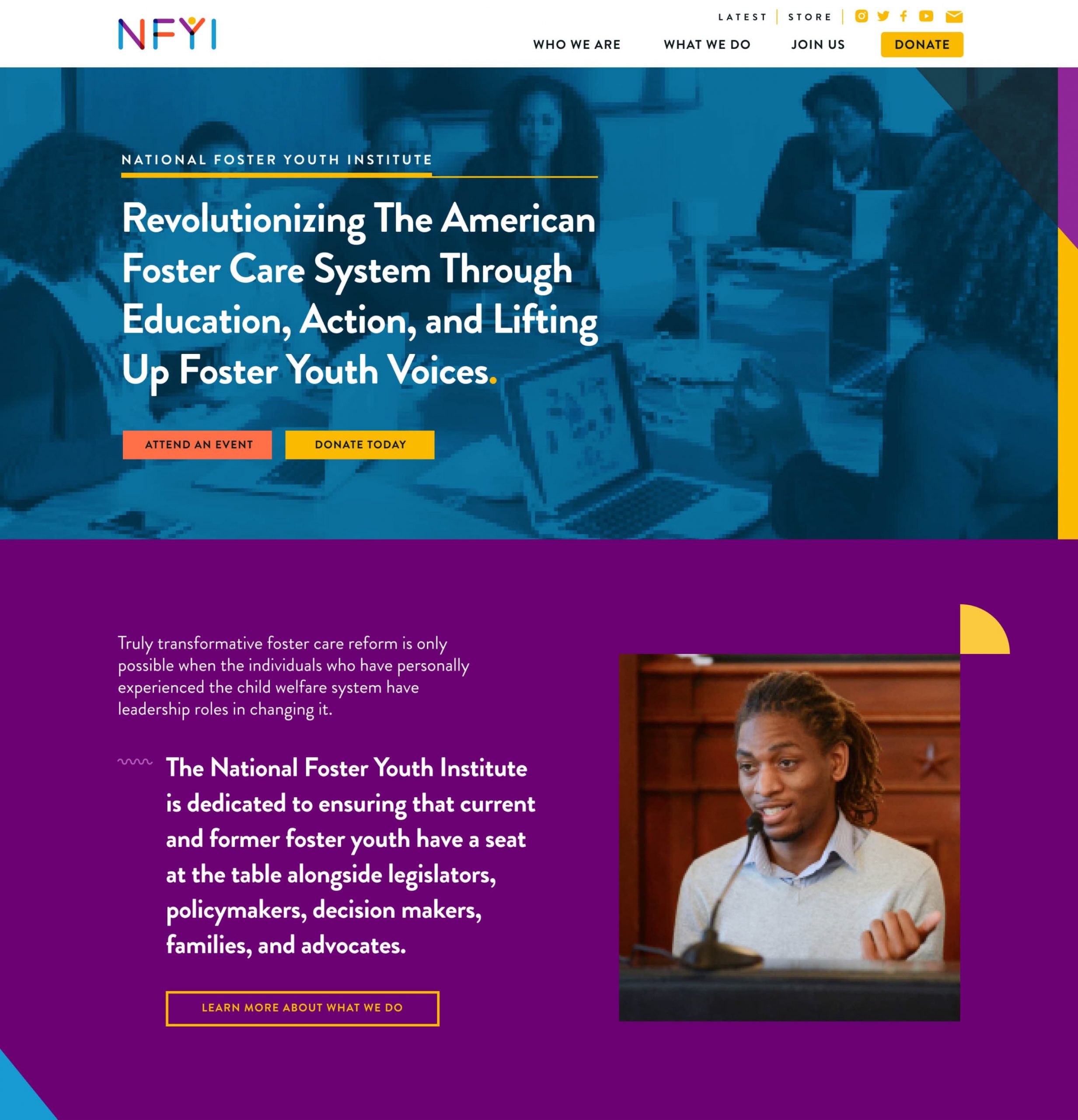
The NFYI website is bold, colorful, and engaging. The logo sets the tone for their organization’s playfulness and creates a strong color palette. The colors are reinforced in the duo-tone imagery, UI elements, and buttons. The main navigation is simple with only 4 navigation items, making it very easy to find content. Even the tone of voice used throughout the site is professional but approachable.
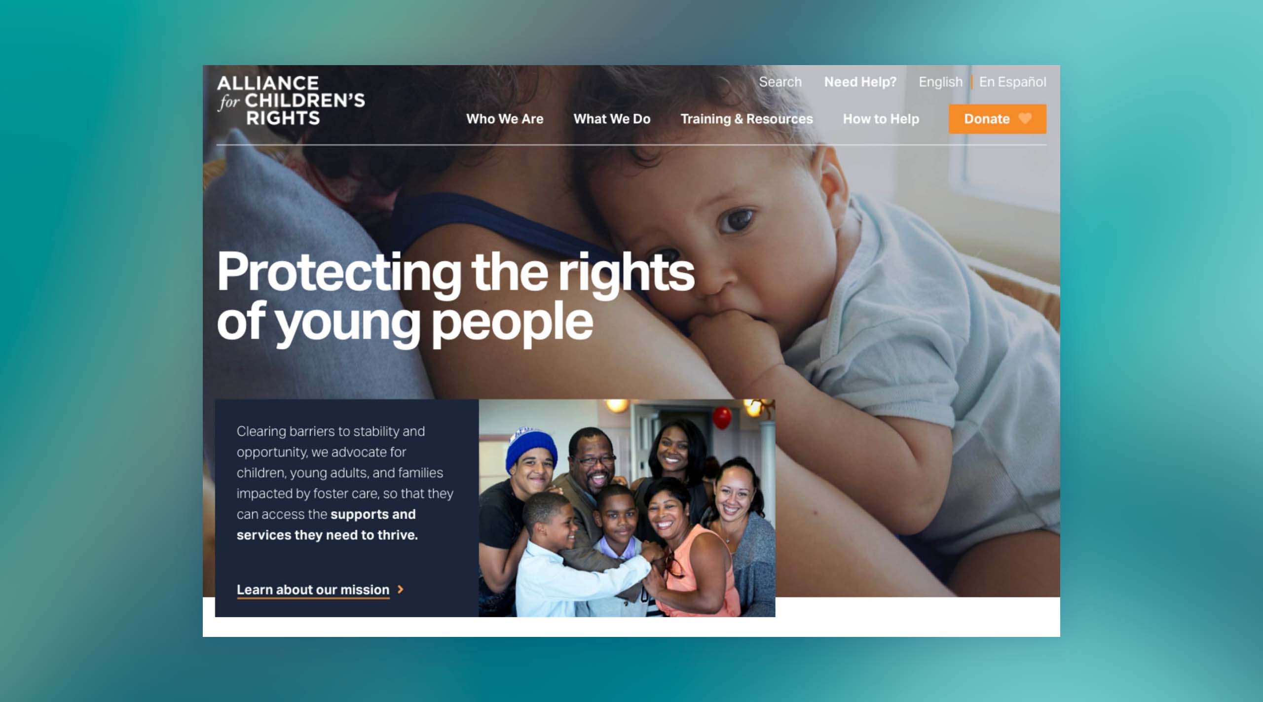
2. Alliance for Children’s Rights
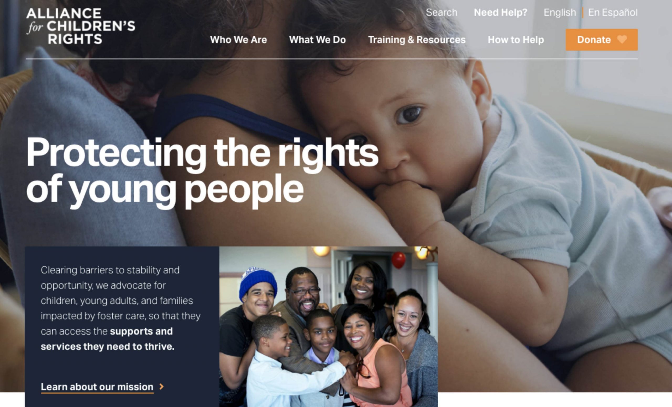
The Alliance for Children’s Rights website sets a different tone. It’s mature, professional, but friendly. The colors are more neutral but use the Alliance orange to attract the user’s attention. The navigation is more full but it implements an organized mega-menu dropdown to make all pages visible to the user. This brand knows exactly who they are, what they do, and how they want the world to see them.
3. John Burton Advocates for Youth
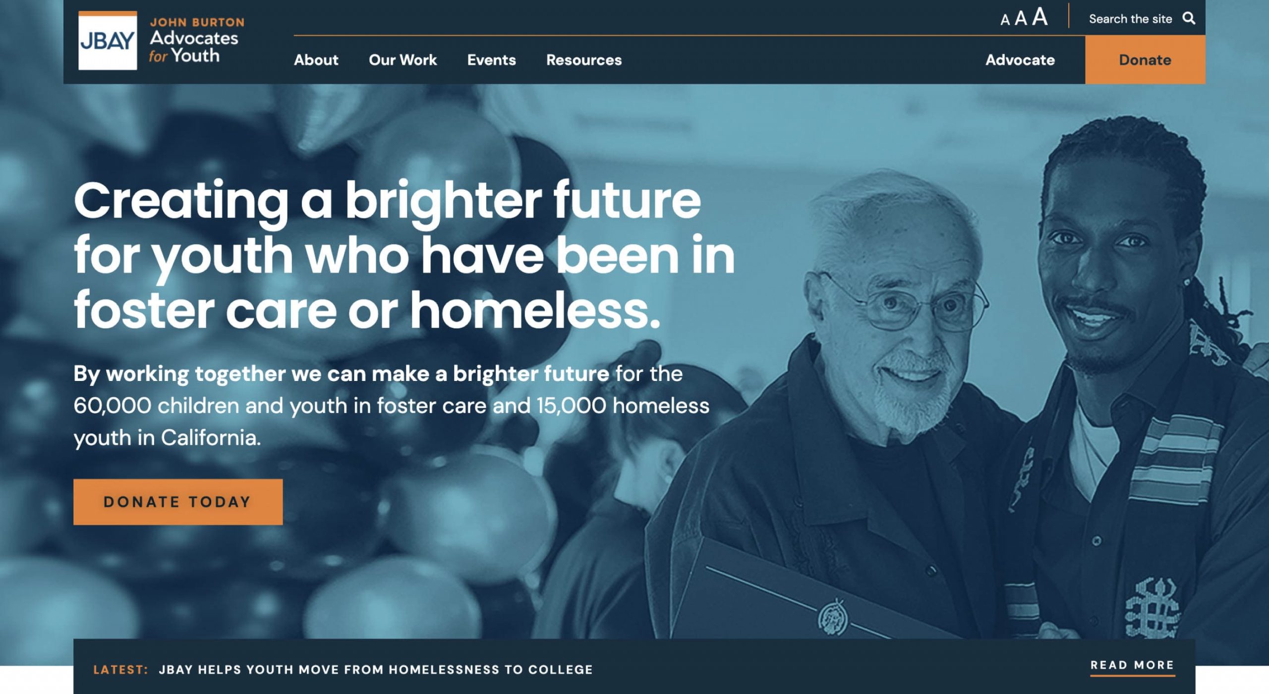
This foster youth nonprofit website, JBAY isn’t afraid to be bold. They also use navy and orange, but the tone is different. The overall design borrows ideas from print design, giving the JBAY site a nod to the massive amount of publications they release. The minimalistic navigation uses a mega-menu dropdown to keep information easy to find. JBAY’s website is colorful but still presents itself to the world with professional confidence.
4. Fostering Academic Achievement Nationwide
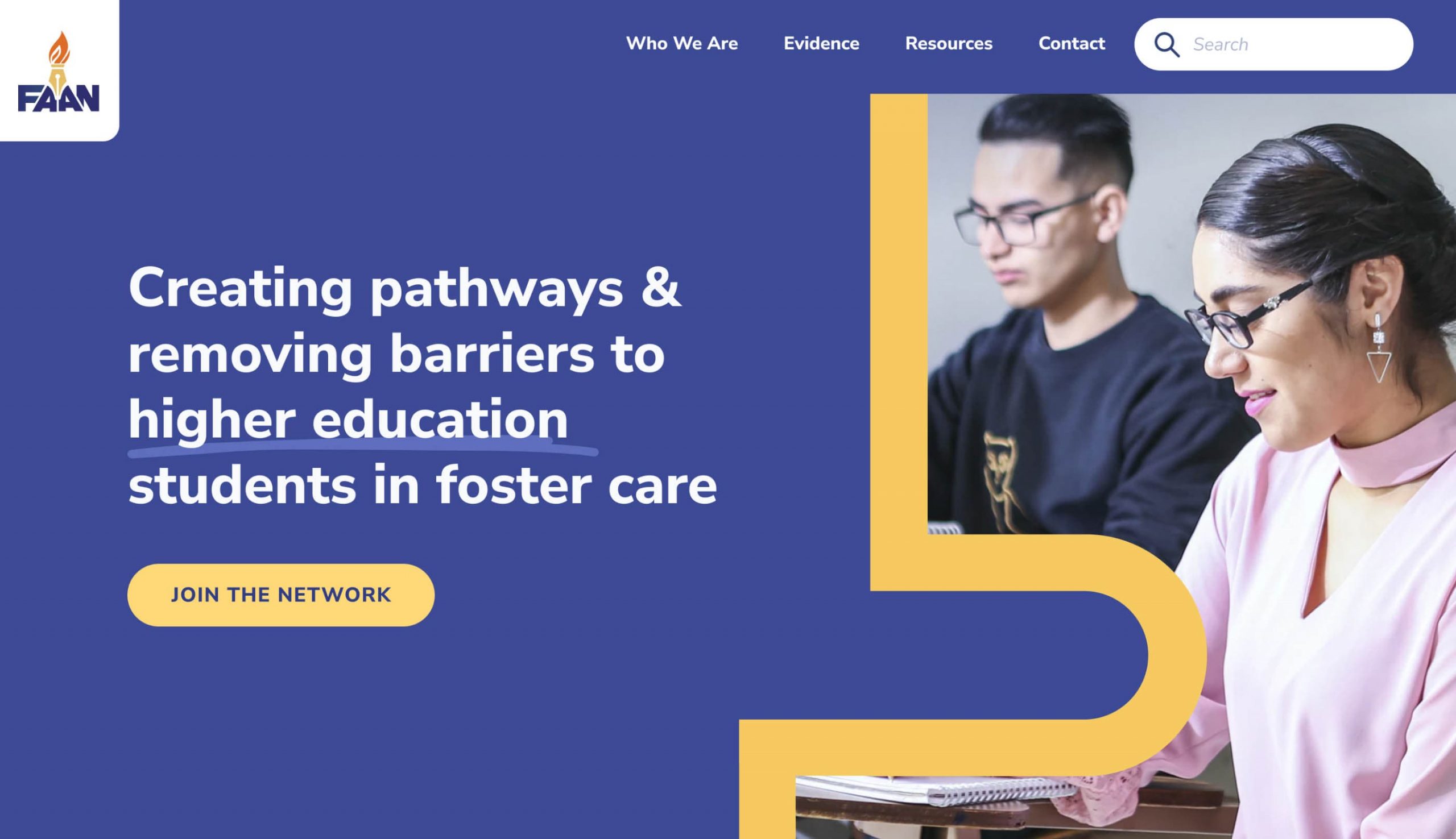
The FAAN website is small, but that doesn’t mean that it’s lacking. This graphic design-heavy website uses shapes and colors to tell the brand’s story. The website’s tone is youthful, playful, and professional. This website is a great example for small organizations on how to create an impact without needing too much content.
5. Foster America
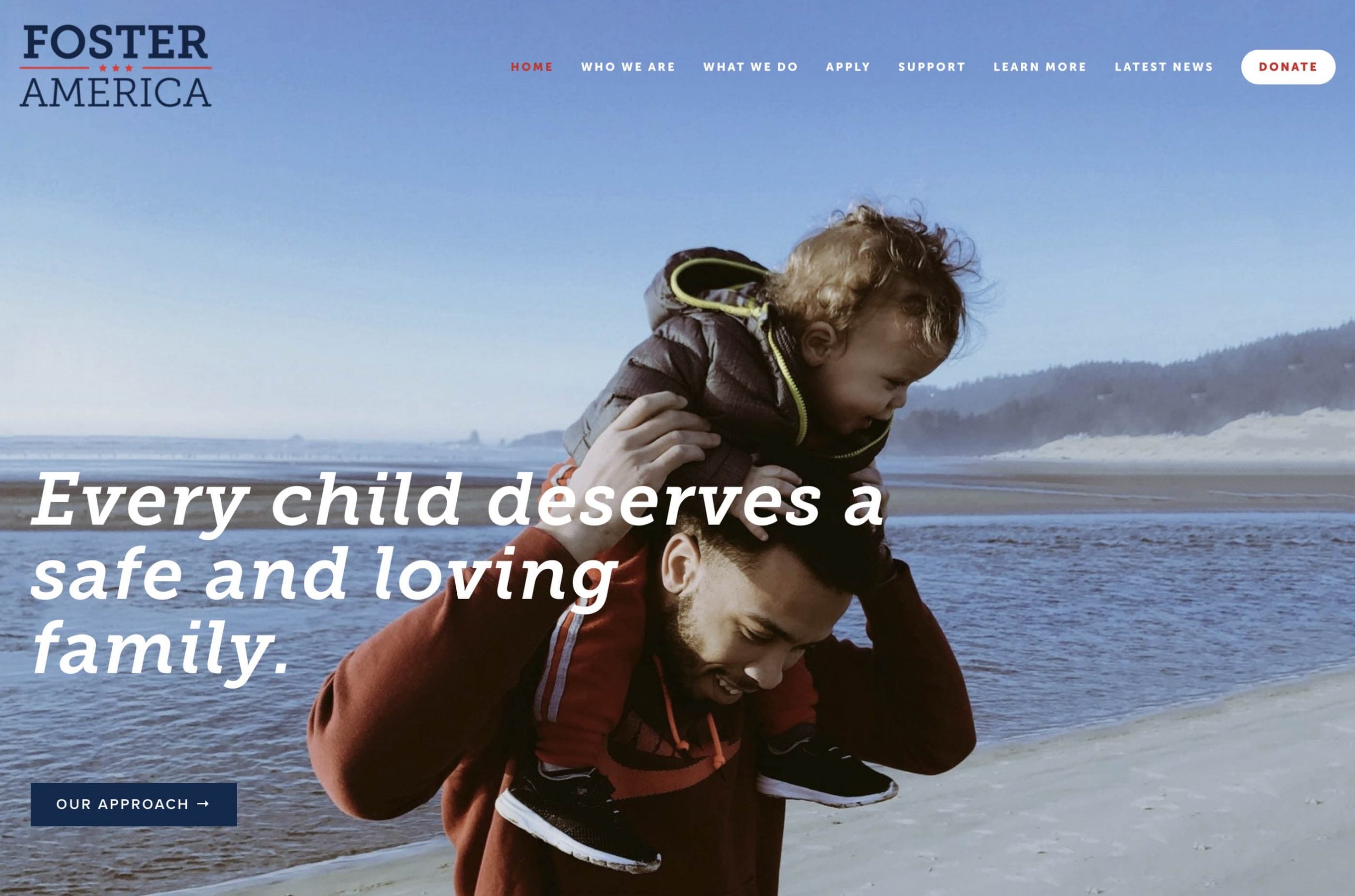
This Foster America website is bold, in all manners of the word. The bold slab serif, dark colors, and large images give the feeling of confidence and strength. The navigation is longer, but it is still easy to find whatever content you might be looking for. Making the donate button stand out on its own helps reinforce the action they want the users to take.
6. Youth Villages
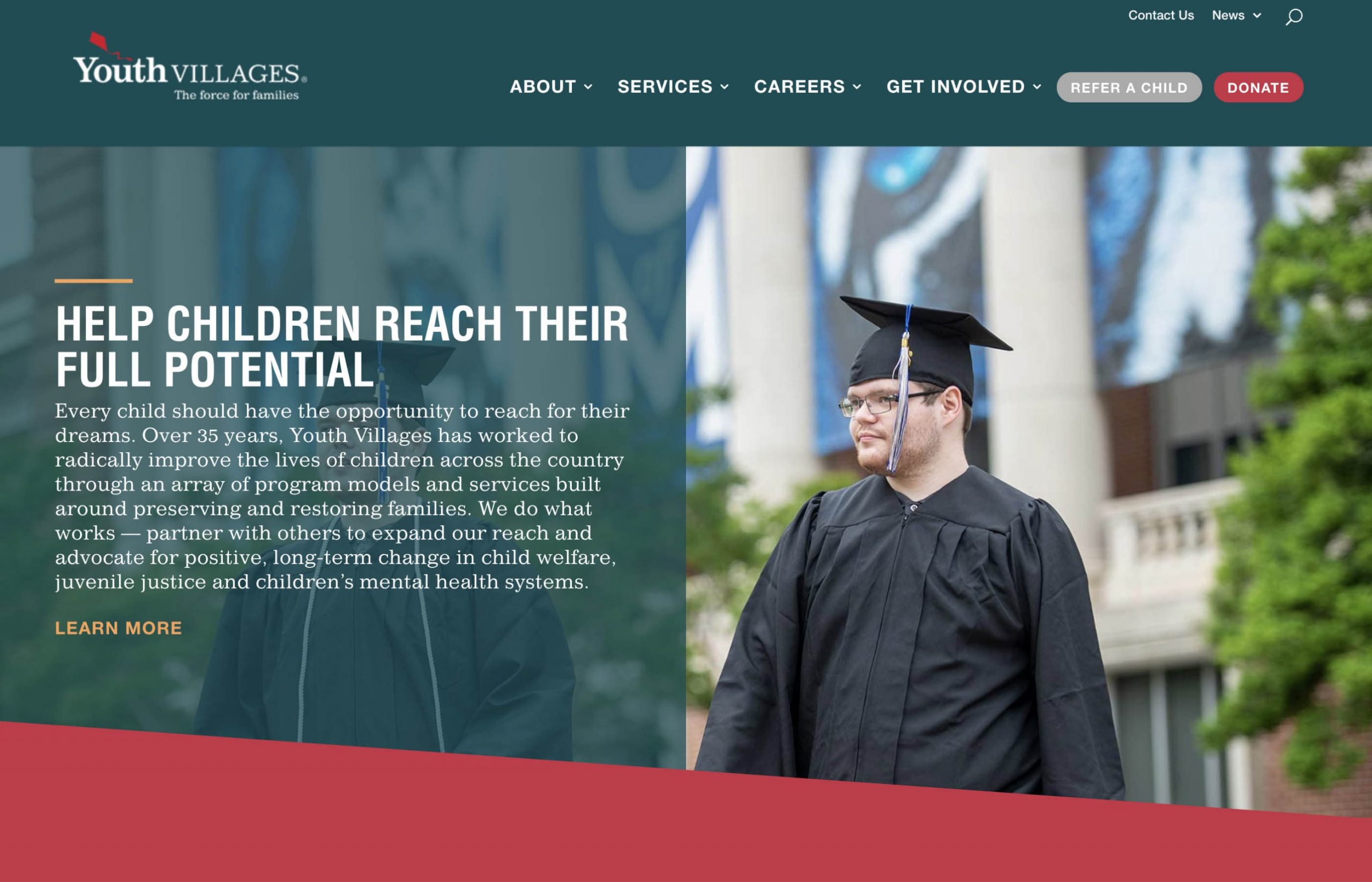
Youth Village’s foster youth nonprofit website is elegant and clean. They mix a dark teal with a bright red and gold to give the feeling of professionalism and dignity. We love their use of infographics on the home page to help visually tell their story and impact. It’s easy to see the call-to-action buttons and the flow encourages the user to take the appropriate next step.
7. United Friends of the Children

We love the dark color palette on the United Friends of Children website. The whole website feels mature, professional, and confident. The navigation is interesting because the main pages of the site are hidden behind a hamburger menu and Donate stands alone in the top right of the screen. This is good and bad in two ways. The good is that the easiest action to do is their goal: Donate. It’s bad because it requires an extra click every time you want to navigate to other pages on the site. If you see a high bounce rate, consider ditching the hamburger menu in favor of visible navigation.
8. Think Of Us
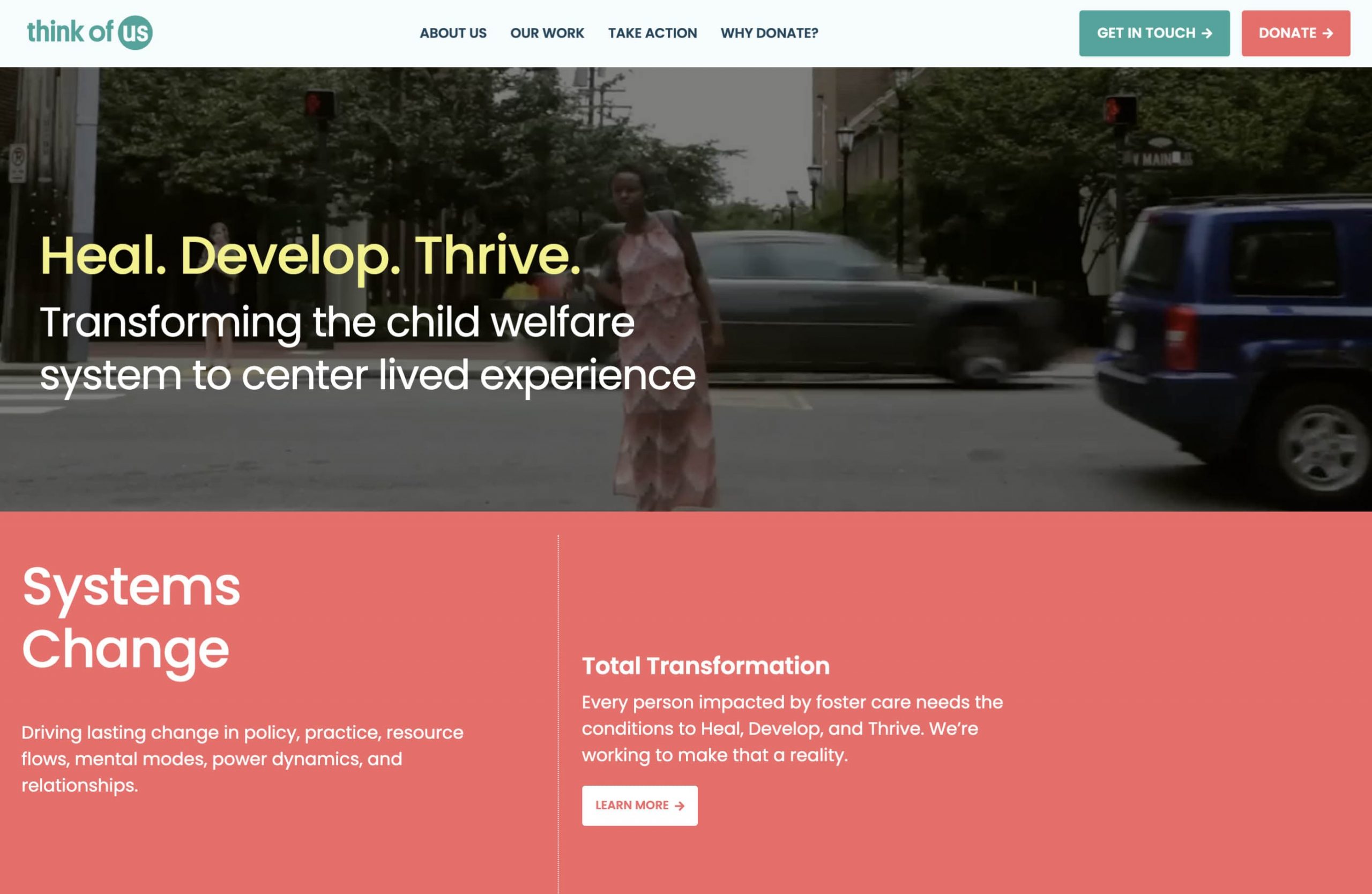
This Think Of Us website is so playful, colorful, and youthful. They use a blocky layout to convey their brand’s character. We love the bold brand colors, animated illustrations, and hover animations throughout the site. It makes the user experience more enjoyable. They also do a great job with building simple navigation and making the main call-to-action items stand out.
9. Foster Care Alumni of America
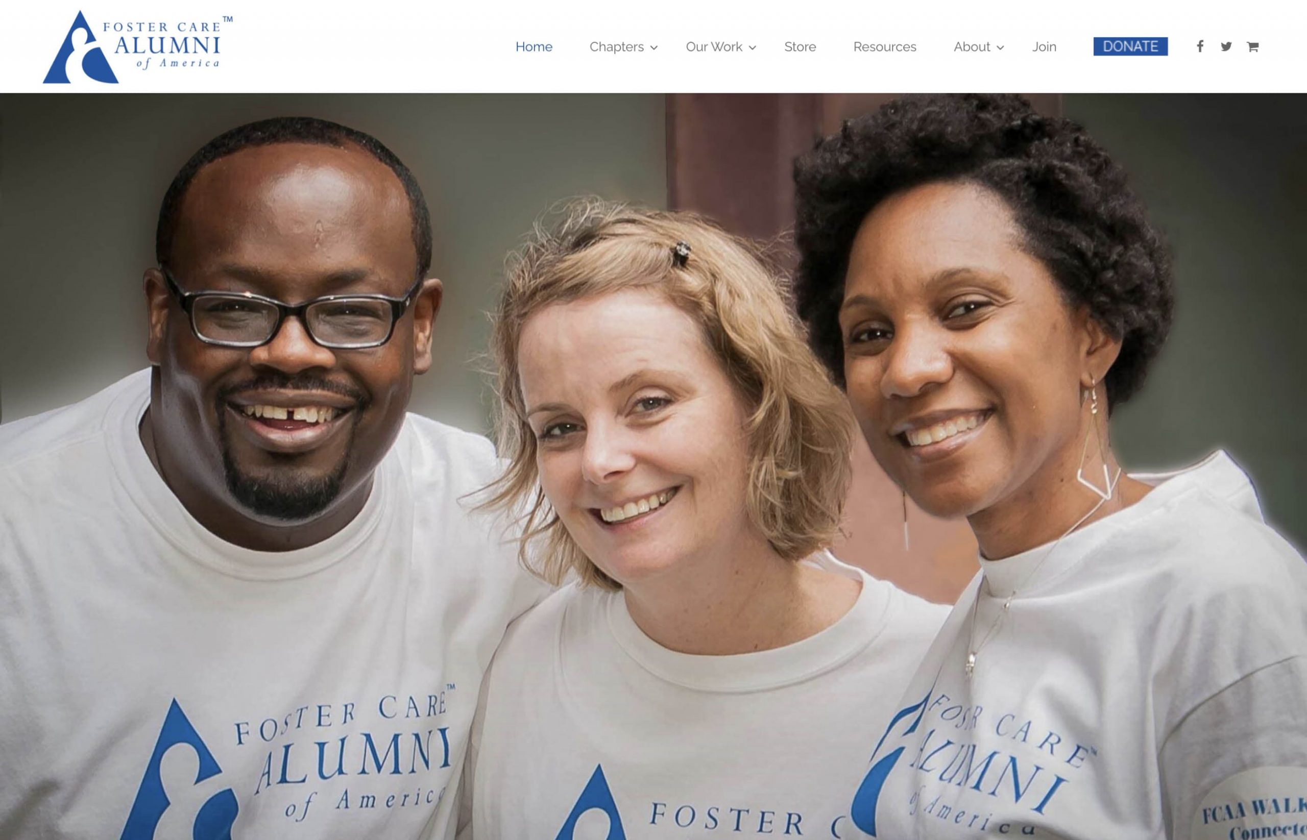
This FCAA website is elegant and minimal. Their chapters dropdown is a unique way to surprise the user as they explore the website. The colors and font styles are consistent, building a solid brand experience. The one thing we recommend is always having is a main heading (H1) to give better context for the visitor and Google’s search bots.
10. Court Appointed Special Advocates (CASA) for Children

This main CASA website is beautifully built. It’s simple but bold and consistent from top to bottom. They introduce their brand even before the navigation, which is an interesting way to create a unique experience. The website creates confidence and maturity for this national nonprofit organization.
Designing your foster youth nonprofit website can be simple when you have a look and feel in mind. We hope these examples of foster care websites give you fresh ideas for your organization’s next website redesign.
Editor’s note: This post was published in October 2021 and has been updated for comprehensiveness.
If you want help with your next nonprofit website, feel free to contact us at Brave Factor. We would love to help your brand evolve and expand.