Arts Education Nonprofit live in the creative world. They have to excite and inspire to bring more participants through the door. Since websites are one of the biggest investments you can make as a nonprofit, it’s important to create something that reflects your brand.
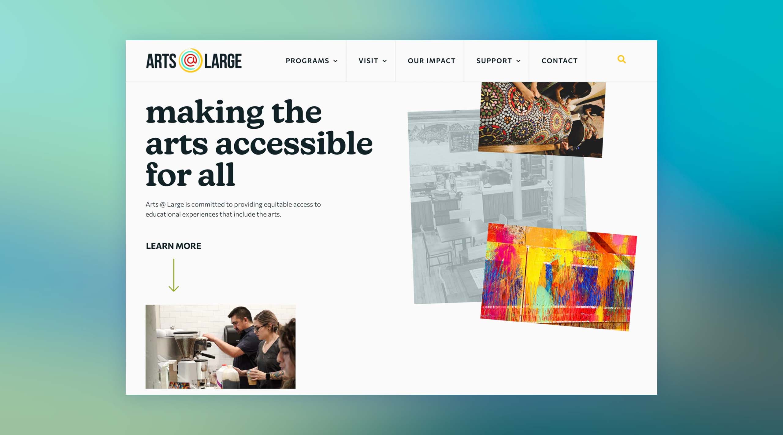
1. Arts At Large
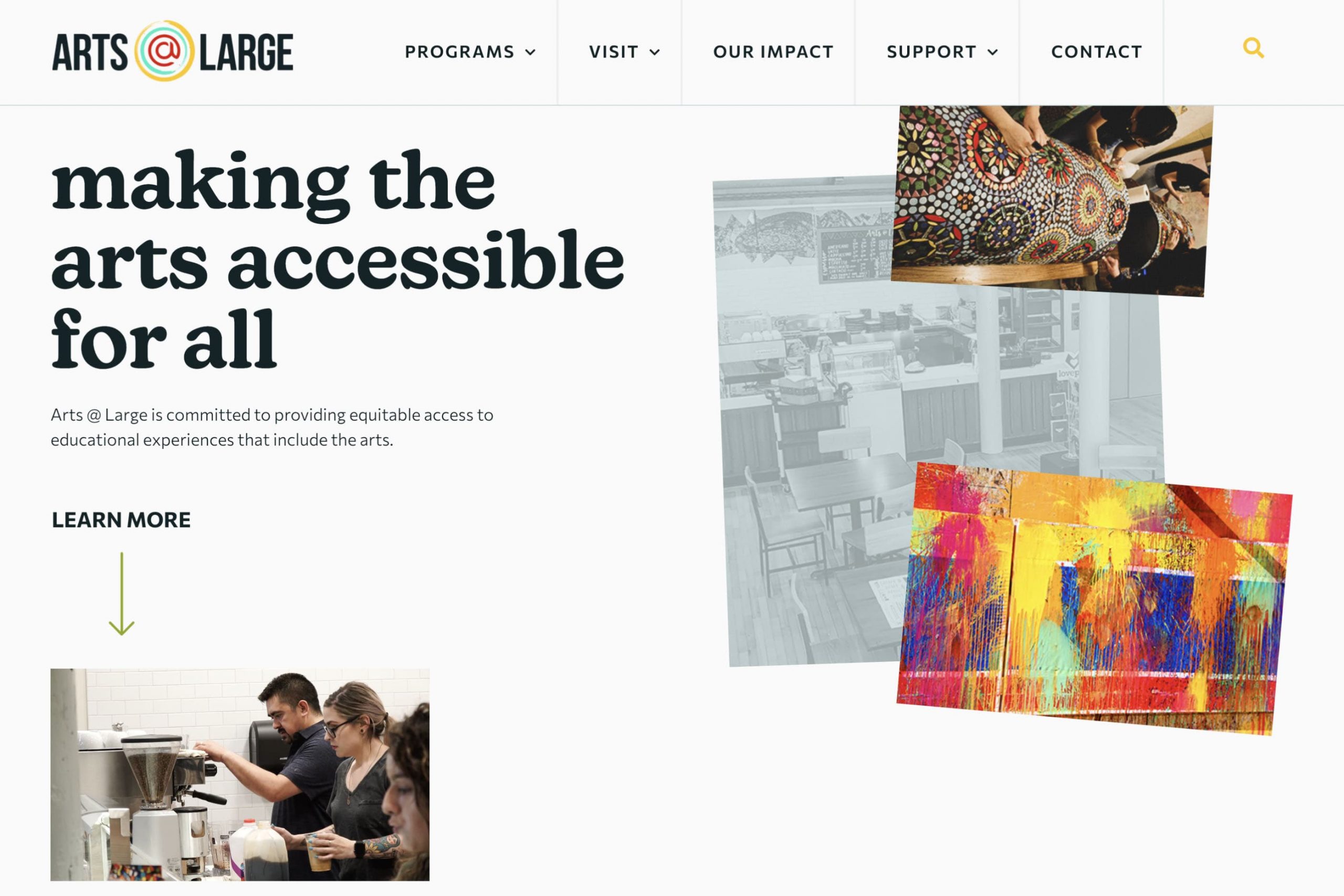
We love the use of white space and collage-type photos. This website feels professional, clean, and still friendly. The choice of font is funky but still mature. The use of colors is bold, but it works. This is a confident design that knows exactly who the brand is. The navigation is super simple with a minimal search icon, just in case you can’t find what you are looking for. This site is, by far, our favorite website for arts education organizations.
2. P.S. ARTS
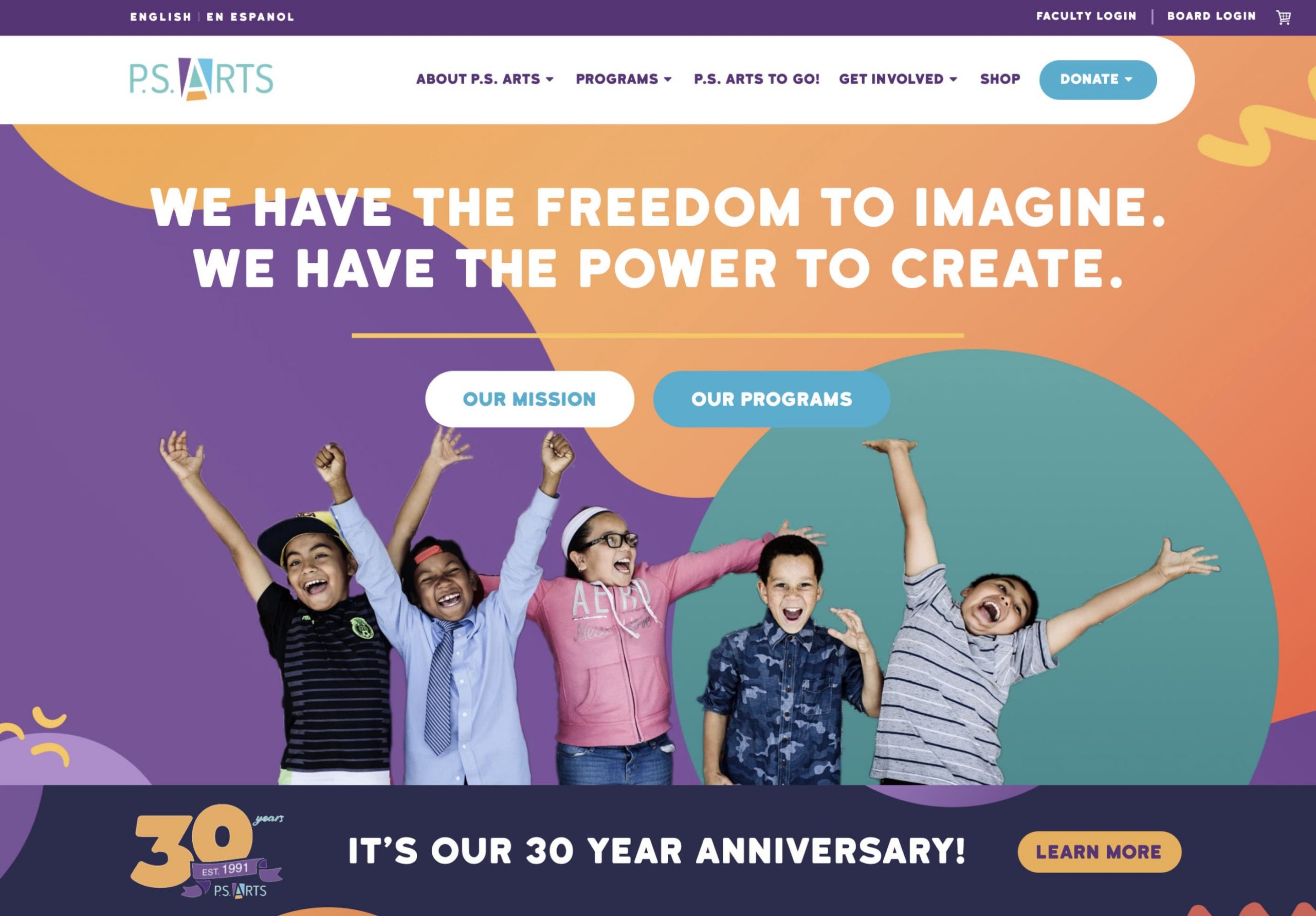
This website is so fresh and unique. P.S. ARTS uses a lot of colors, unique shapes, drawings, and cut-out photos. But it all works. The website is bright and energetic. The navigation is in a unique shape that we haven’t seen before, but it’s still simple and easy to find that page you are looking for.
3. COCA
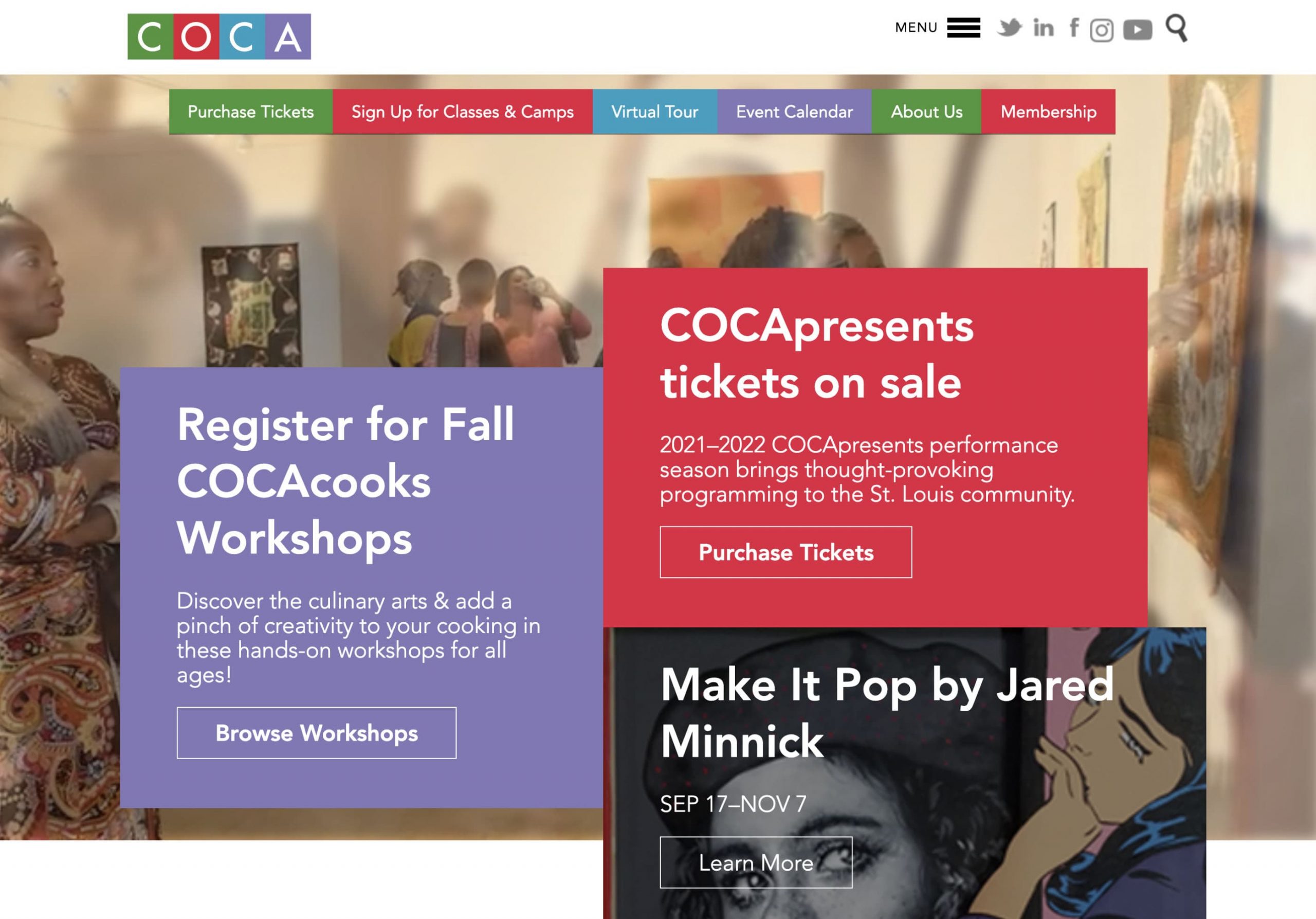
The arts education nonprofit, COCA website is a beautiful example of using a video for a background banner. Their color palette and blocky design are consistent throughout, creating their own unique brand style. The only thing we would recommend changing is the menu hidden in a hamburger design. It makes the user click an extra time on desktop computers.
4. InnerCity Arts
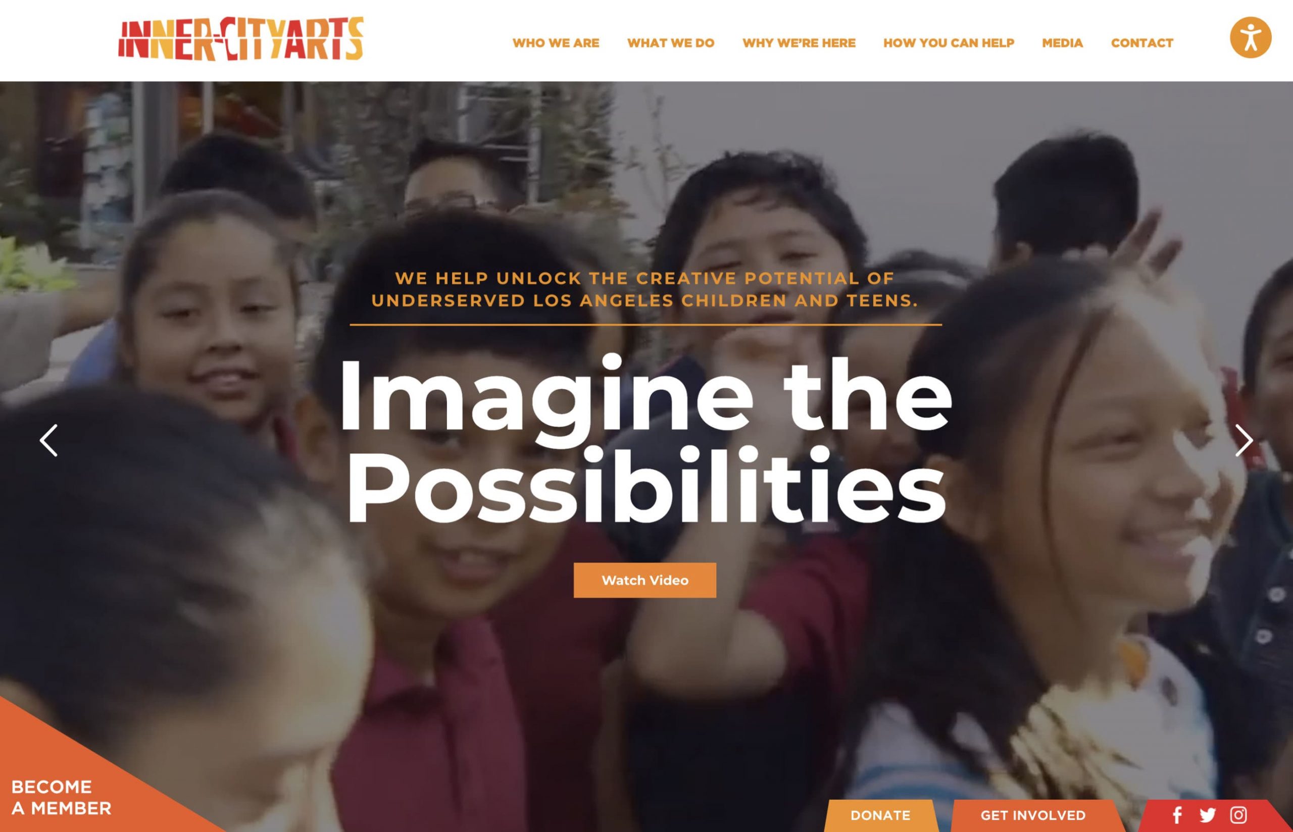
This website for InnerCity Arts also uses a nice video background in the banner. The color palette is consistent and warm, making it very lively and bold. We love the custom illustrations throughout. It feels like InnerCity Arts knows their brand and they conveyed that well in this website design.
5. SF Arts Education
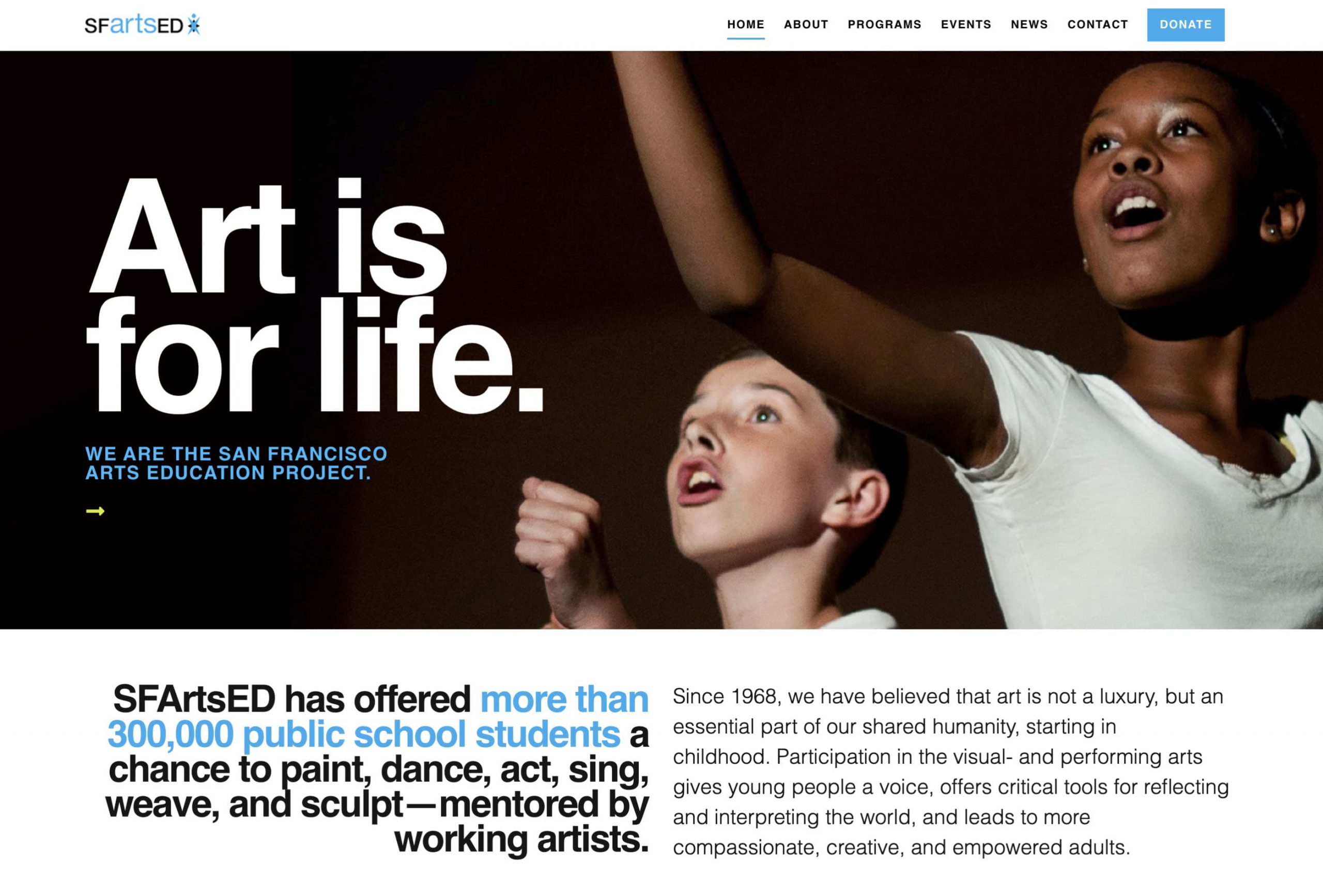
We love giant, bold fonts. “Art is life” immediately draws the eye and defines the whole experience of this arts education nonprofit website. They use a minimal color palette and simple typography to give a modern, edgy feeling. The navigation draws attention to donate, which is great and direct.
6. The Center for Arts Education
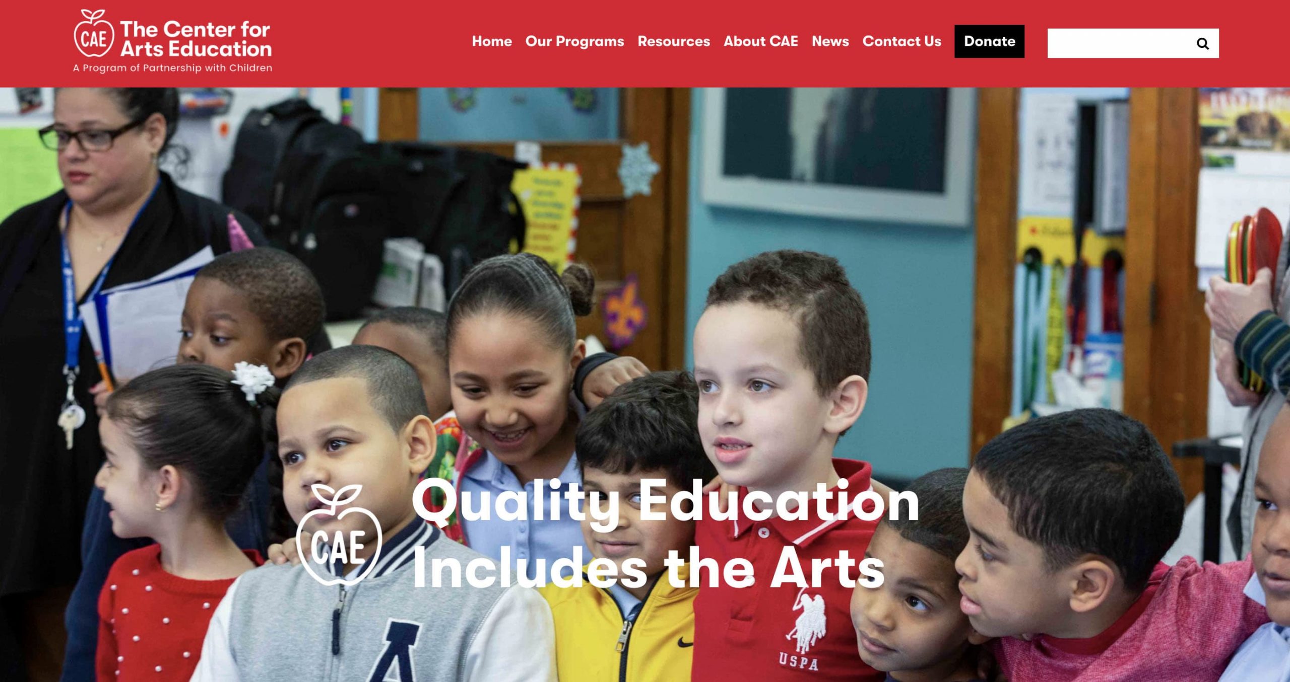
We love the use of primary colors on this website. It feels simple, but there is elegance in simplicity. The whole website is friendly and creative, making users smile as they explore.
7. CASA 0101
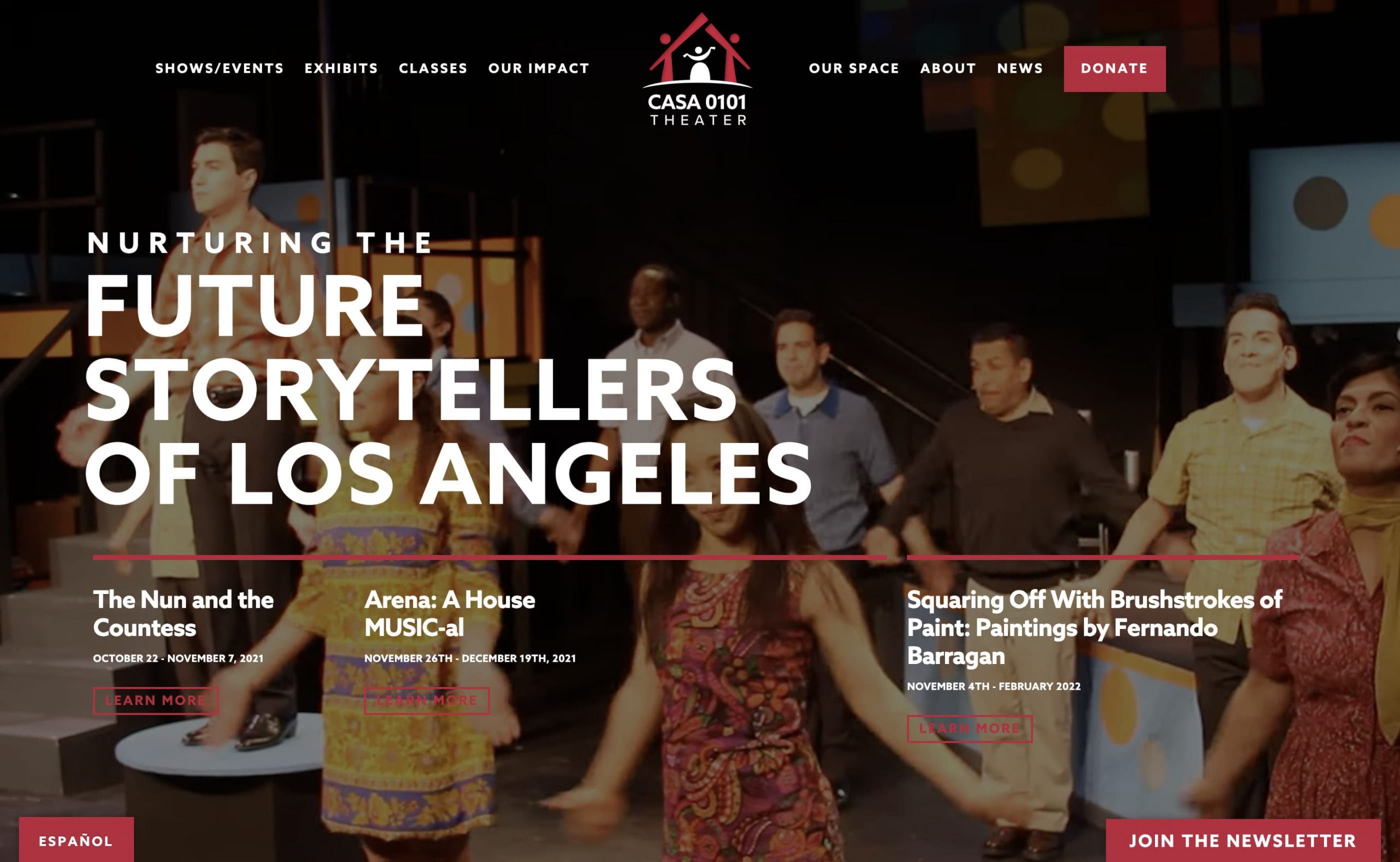
This is a beautiful example of a dark website that is still friendly and approachable. CASA 0101 has a minimal site that is interesting to scroll through and easy to find the next step.
8. Walden School
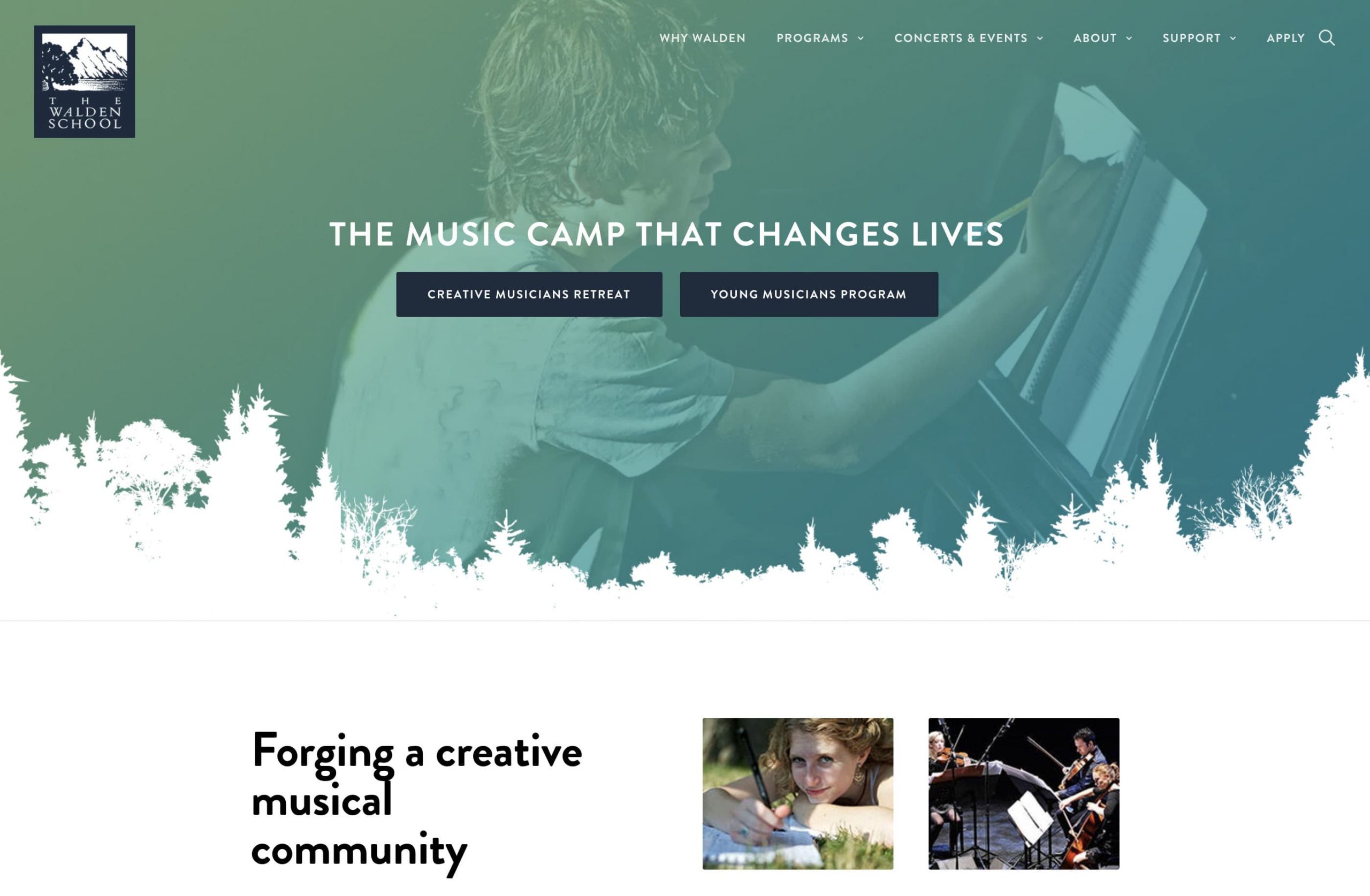
The Walden School Music Camp website is elegant and friendly. Scrolling through, you see smiling and diverse kids, giving you a good feeling of their programs. The color palette is minimal but beautifully done, incorporating their green into creating duotone images.
9. Hui No‘eau Visual Arts Center
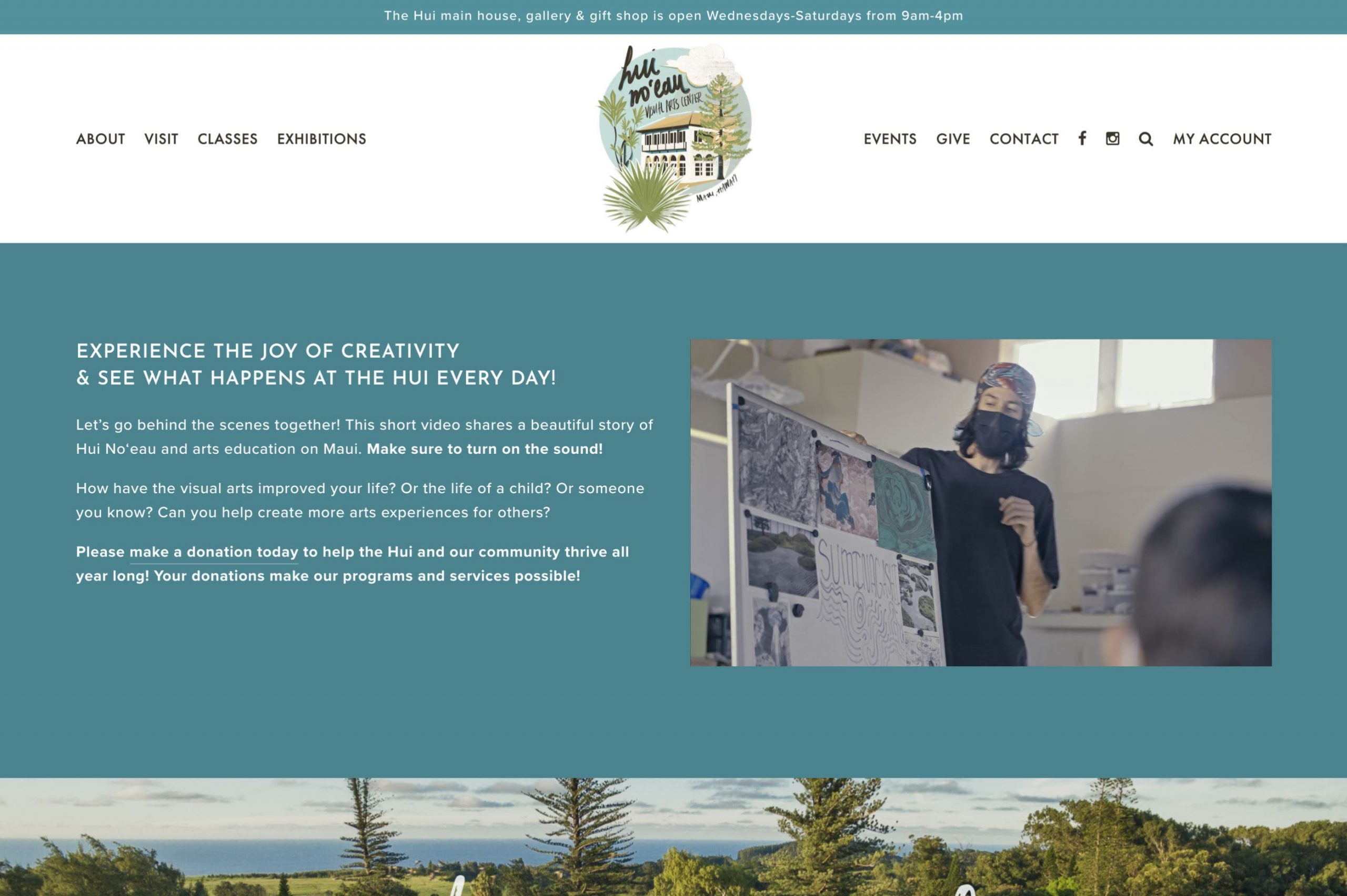
Handwritten fonts and illustrations dance across this arts center website design. This website is simple but so beautiful and soft on the eyes. We love the minimalism, giving more focus to the illustrative aspects of the brand.
10. Performing Arts Workshop
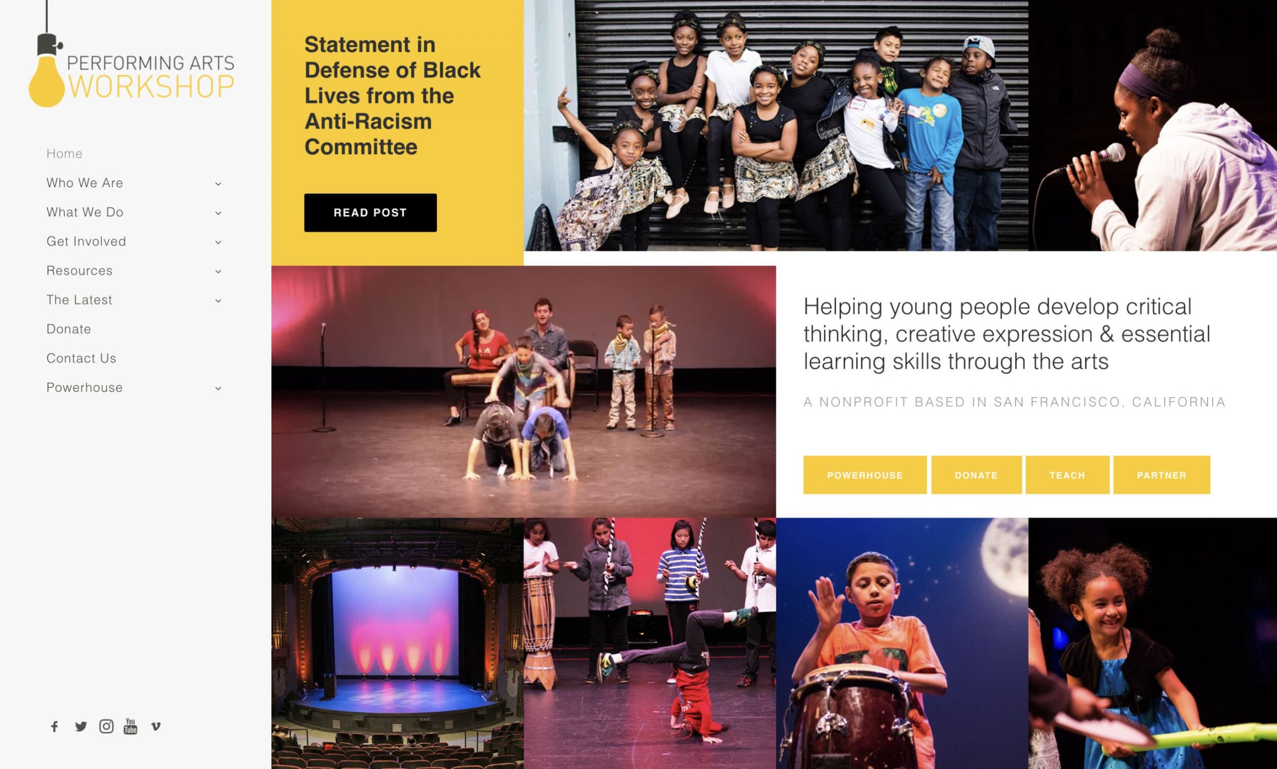
This arts education nonprofit website is so fun and unique, using a sidebar navigation style and blocky page designs. They use bright yellow, black, and white colors to define a bold brand style.
We hope these website designs give your arts organization some inspiration for your next website redesign.