In March of 2016, I volunteered in Thailand with The SOLD Project. They prevent child trafficking and exploitation through scholarships, mentorship, and resources for at-risk children in Thailand. It is an organization I love and trust.
Quickly into my time (quite literally the first day), I realized they had years of growing pains, mostly coming from the name “SOLD” being negative, not only in English, but in Thai. This lead to the Thai branch having a completely different name (The Freedom Development Foundation), logo, and color scheme.
They asked me for my professional opinion on how to combine a black and red logo brand with a blue and white Thai logo.
So I gave it.I suggested that they change their name.
It was something that they actually wanted for years. Rachel, the President, retells how she would shudder when her students would introduce themselves as “SOLD students.” I was lucky to have been with them at a good time, because it finally felt like the right time for them to begin a 10-month long process of renaming the 8 year old organization, rebranding, and revamping the website.
THE NAME
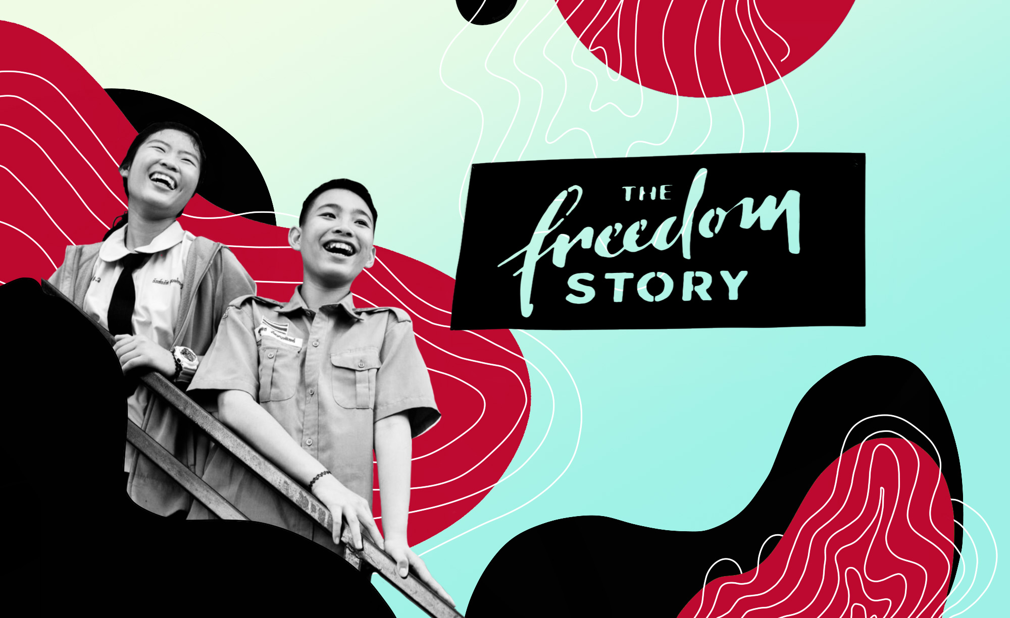
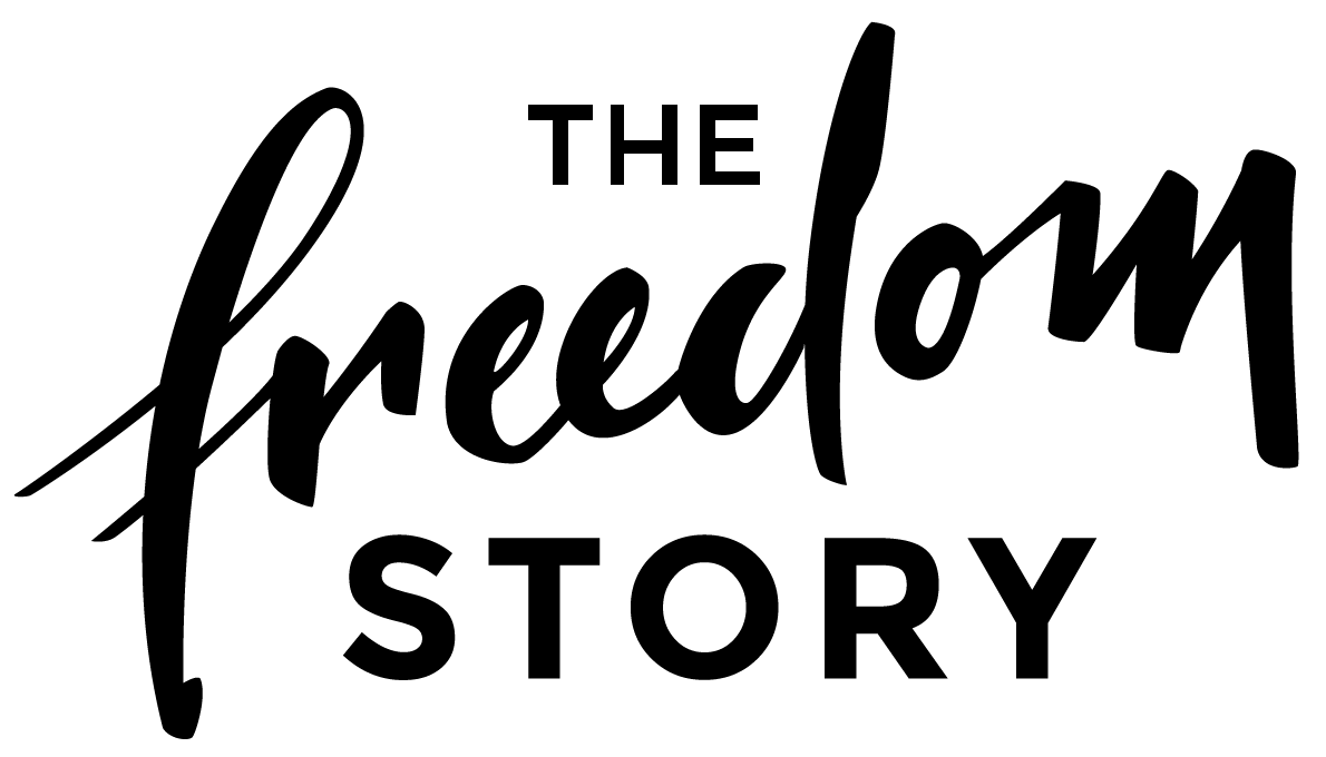
We started with brainstorming on new names. There were a dozen good options, but we kept coming back to the word “freedom.” It is their one-word vision and mission. We wanted to inspire and empower. We wanted give our students the dignity they deserve and focus on the positive (freedom) instead of the negative (enslavement to a system, person, etc).
“Story” was a natural fit because The SOLD Project organization actually started from a documentary under the same title. Storytelling is, at the core, who the organization is.
The President, board of directors, as well as major contributors and influencers important to the organization were all behind the name. And so, after 6 months of naming exercises, we became The Freedom Story.
THE BRAND
We worked with another design, Toby Keller, on the logo and branding. He created a beautiful new logo, pattern, and color palette. We wanted the brand to be friendly, mature, and professional. We went with a custom handwritten font to convey but freedom from convention and the natural, humanness behind storytelling.
Toby then had a great idea to make a modern, pixelated pattern out of the many tribal patterns in Northern Thailand. He created the patterns and we matched it with a very lively, colorful color palette. The main color was blue, to match the Thai branding, but we brought in some hot pink to have some call-back to the old SOLD branding.
THE WEBSITE
Finally, my favorite part of the process: upgrading the website. We wanted to improve the language and messaging of the old site. It was focused too heavy on sex trafficking and not enough on empowerment and freedom. So over the course of an intense month-and-a-half, our little team of three worked on creating an amazing website for the new brand.
We wanted to create a bold, positive, powerful website. We focused on heavy-handwriting to make a personal impact, then used a clean sans-serif to give the site a modern and friendly feeling.
An important aspect of the website is storytelling. We built out a custom section on the website to host students’ stories, making is simple and impactful to the user. Our goal was to introduce the viewer to the student, tell their story in a powerful, and move them to action by the end of the page.