A quality logo is essential to represent your organization in the best light possible. Your nonprofit’s logo serves as an important marketing tool and tells your story. With so much riding on your nonprofit’s logo, it can be easy to get stuck when designing it. Here are our logo design tips to keep in mind:
1. Don’t design your logo in Word, Powerpoint, or Canva – While it is tempting to make a DIY logo, it is a reflection of your brand’s credibility and longevity.
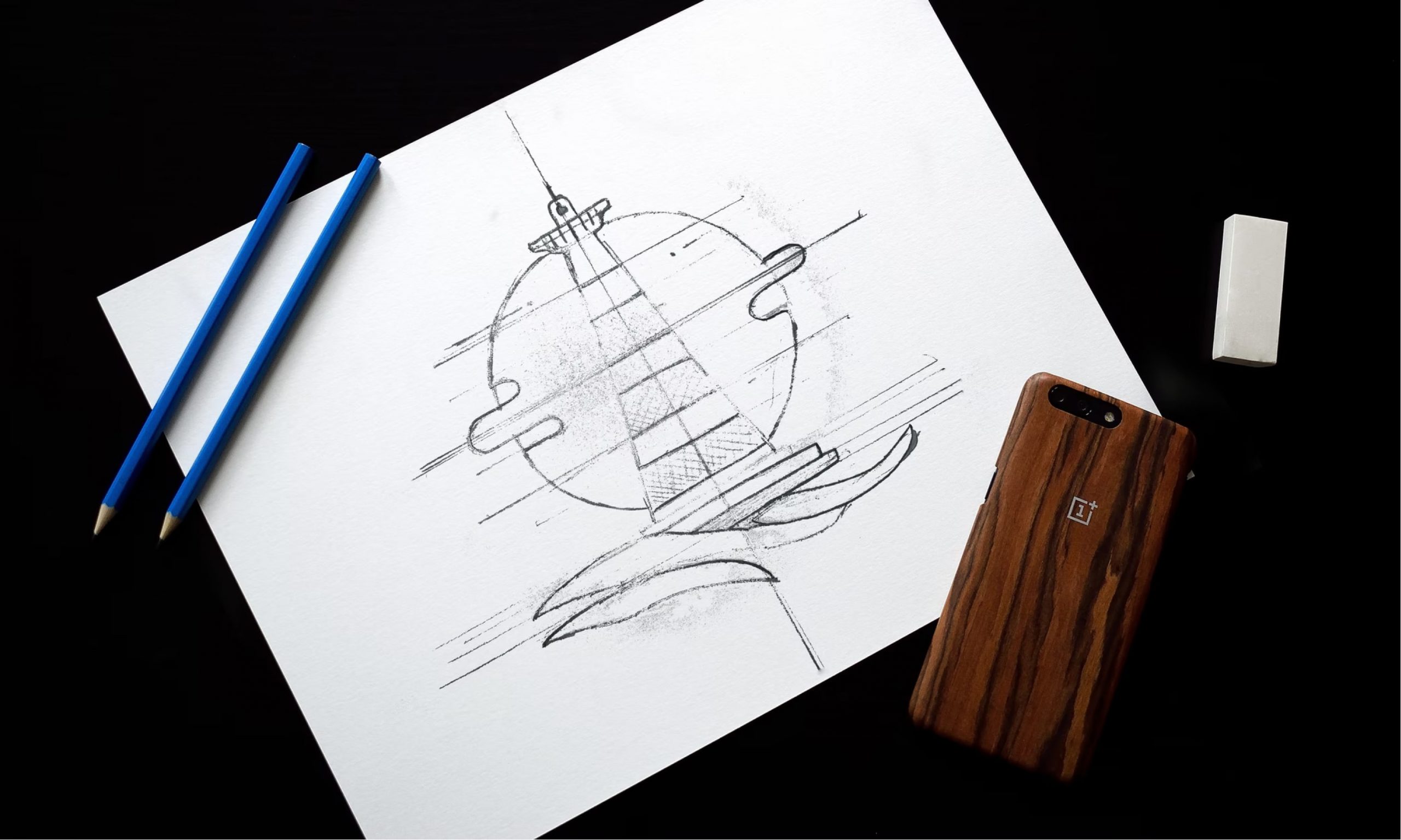
2. Tell your story. Your logo should represent your nonprofit’s mission or service. Brainstorm what symbols or words best represent your nonprofit.
3. Simple is better. A good logo should be recognizable, even at 0.5 inches tall. Anything with too many details can get lost. Test your logo as a social media profile image to see if it can still be recognizable.
4. Keep a simple color palette, including the ability for the logo to be all white or all black. There may be cases that you need a one-color option, and if your logo depends on color to make it visible, then you might need to readjust.
5. Make it lasting. The last design tips is your logo should not need any drastic alterations once created. Design it so that it can last 10 or 20 years. Your nonprofit’s logo is the first step in marketing your organization and growing your cause.
Branding and logos with Brave Factor
We can support your nonprofit beyond strategy or logo design. We also help with business card, annual reports, infographics, letterhead design, and more. Learn more about our branding services. and graphic design.


