Gree EnergyReducing climate change through design by partnering with a global biogas solutions company
Gree Energy develops biogas solutions for food processors in emergent countries. After finding success in funding and expanding its programs, Gree hired Brave Factor to help them refine its brand messaging, upgrade its branding and create a more impressive digital experience.
SCOPE
Digital Strategy, Logo Design, Web + UX Design, Custom WordPress Development, Collateral Design
INDUSTRY
Environmental
LOCATION
Global
YEAR
Completed in 2022

The Challenge
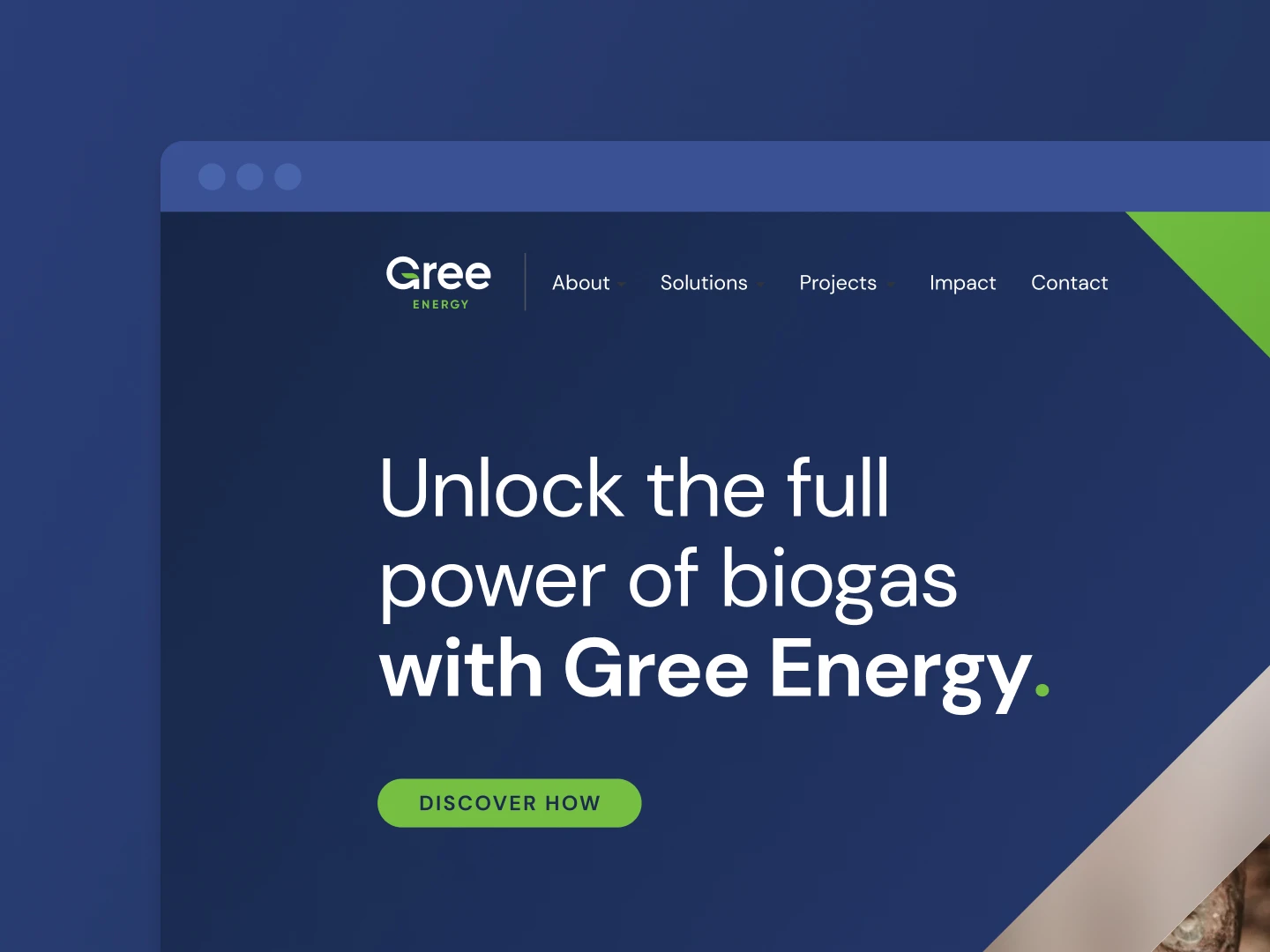
Gree’s original website focused too much on solutions, and less on their story, impact, and benefits. They also had the challenge of looking too young. As a startup in a newer industry, they needed to ensure that their brand’s look conveyed maturity, experience, and professionalism. They wanted the new website to create a consistent, positive brand experience accurately representing their identity, vision, and values.
The team communicated well on progress and took the initiative to suggest ideas that we didn't think of.
Insights
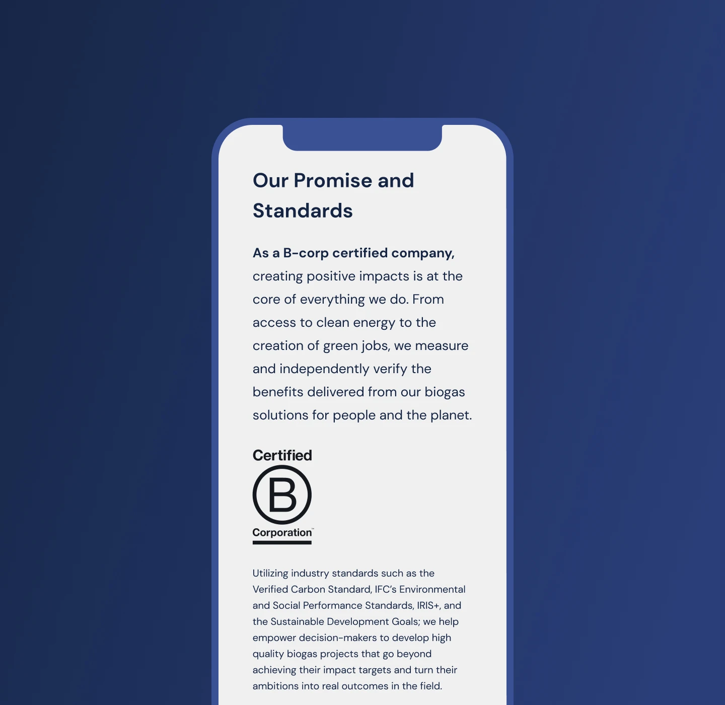
We worked with Gree for an extended time to make sure their brand messaging and customer journey was correct. With the help of their behavioral scientists from Hong Kong, we defined their brand positioning, target audience’s unique needs and challenges, and communications approach. The goal: to communicate the benefits for each target audience type and, through storytelling and stats, make a solid case to work with Gree over all other biogas providers.

The Results
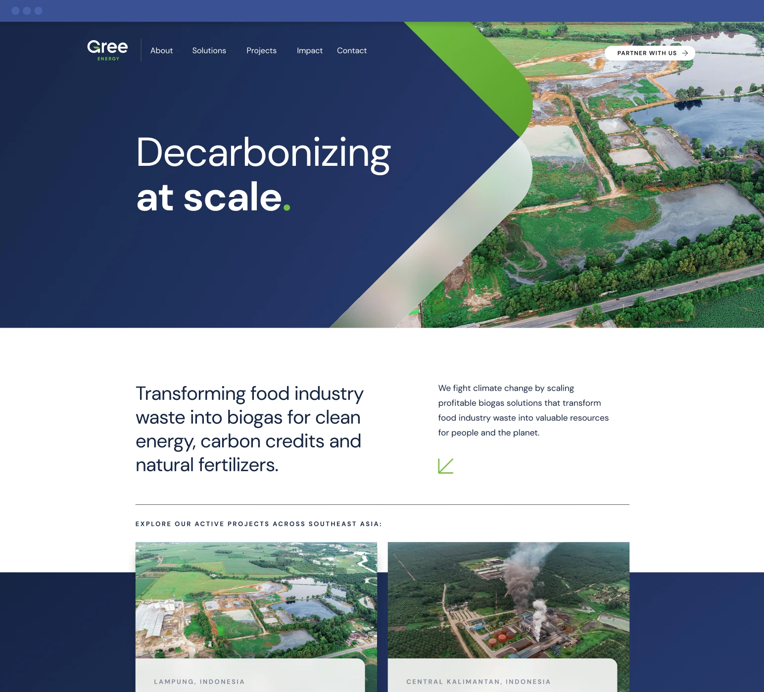
Gree wanted a beautiful website that helps drive their target audience to contact them. They wanted it to reflect their narrative story and create interest in biogas solutions. They also needed help making their brand messaging avoid going too much into the weeds, focusing on solutions, competitive advantages, and impact.
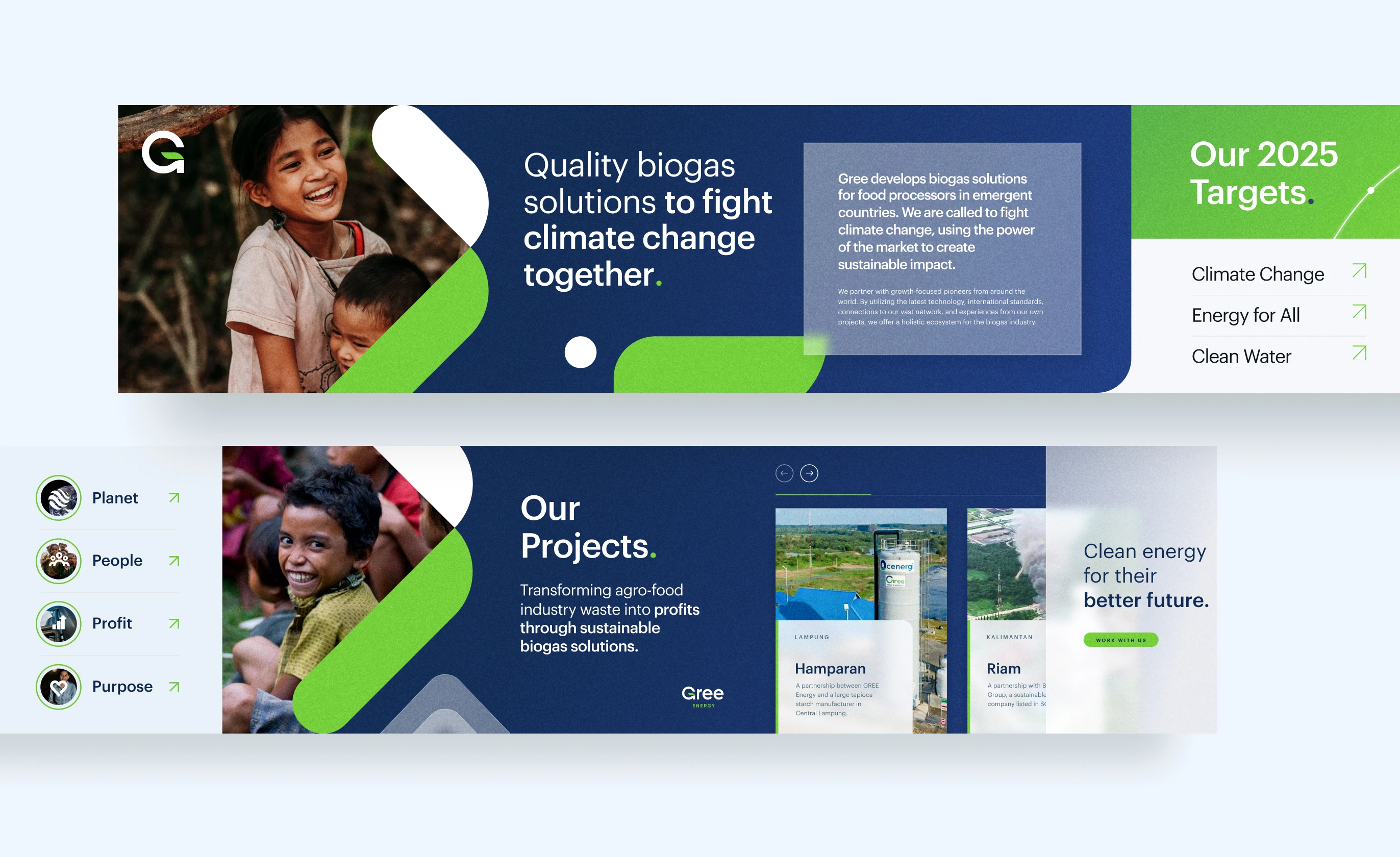
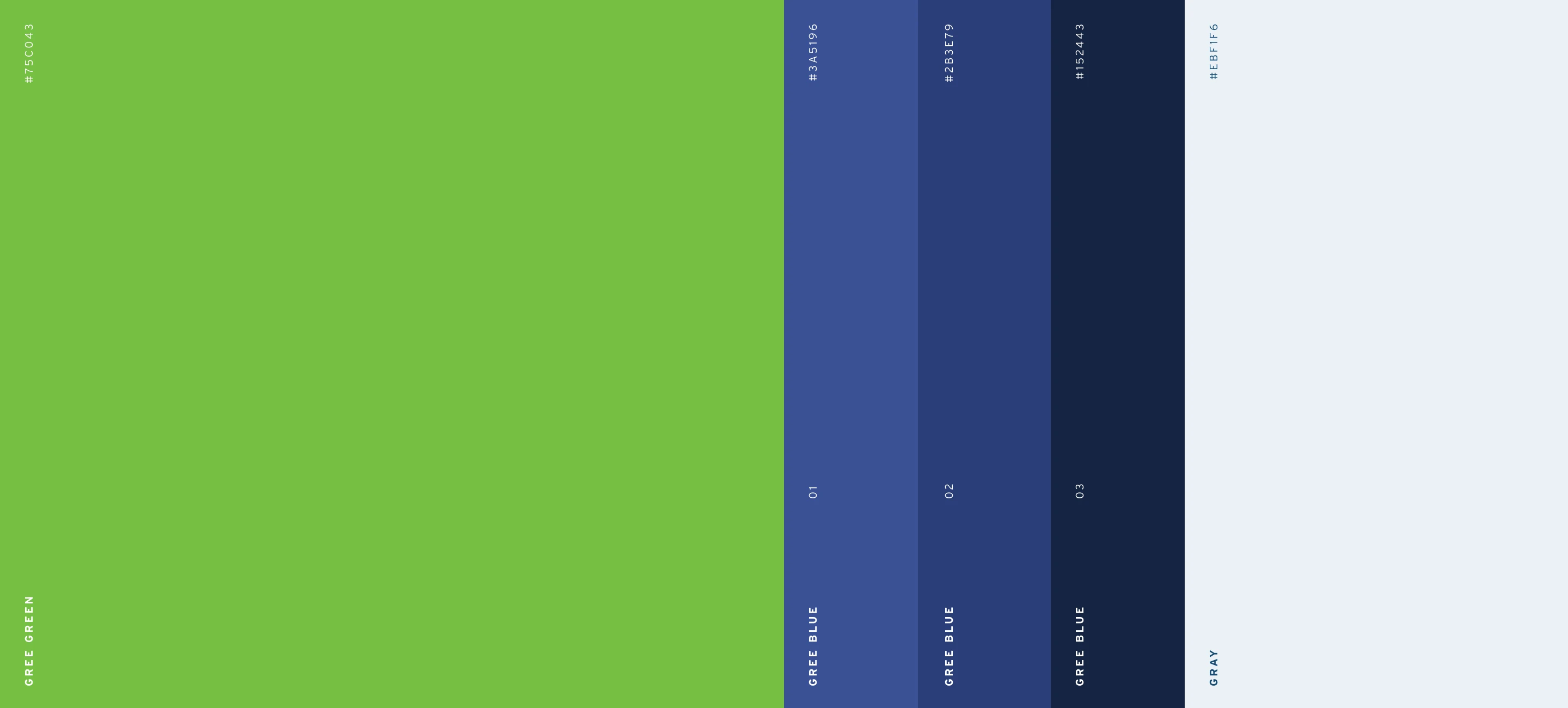
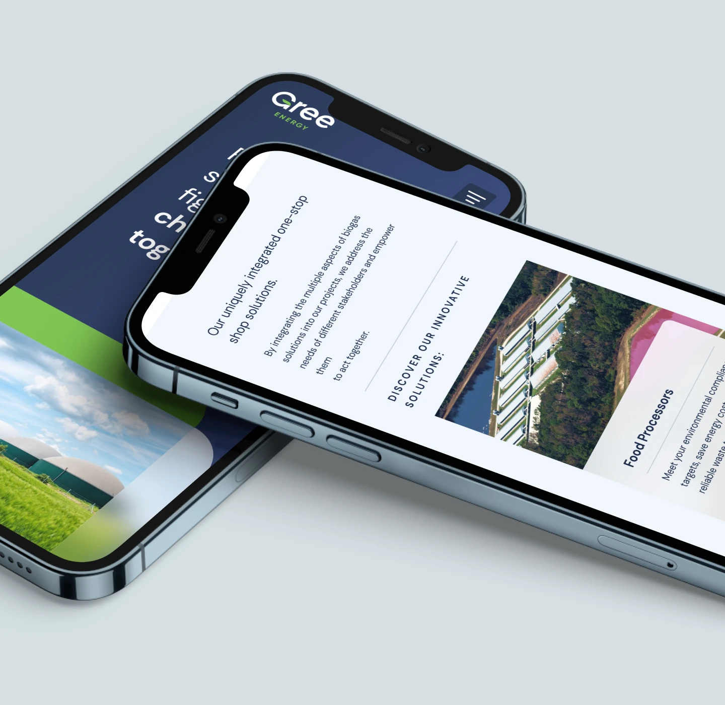
We worked directly with them to structure their website, content, and story in a way that interests users and clarifies Gree’s service offerings. We created a bold, vibrant style for the design, using their logo’s shapes to create unique row dividers. We wanted to ensure the website’s style felt experienced, sophisticated, and professional.
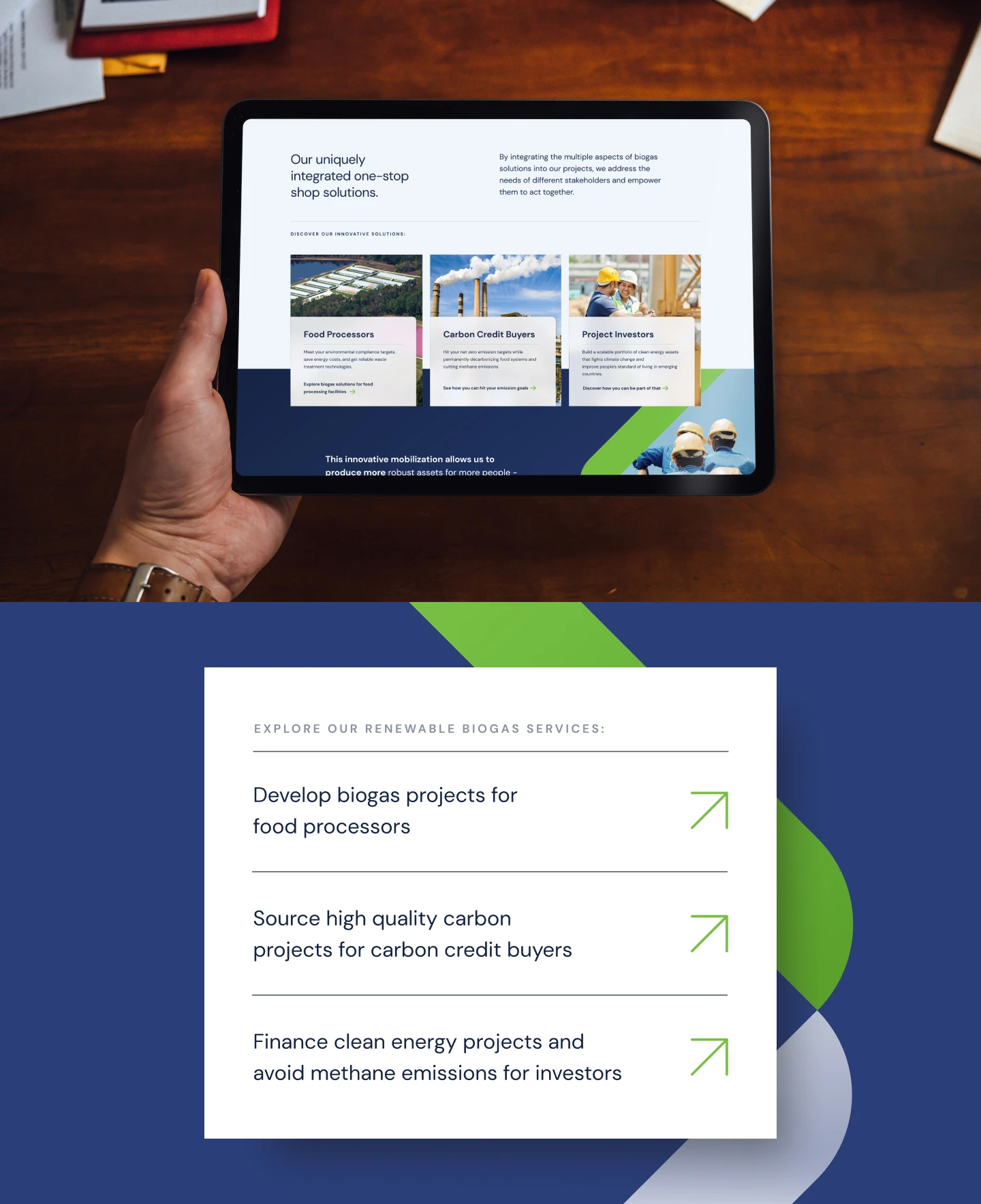
To specifically address each unique target audience type, we created landing pages written directly to their needs. At the end of each page, we collect contact information specific to the target audience type to better engage with them later.